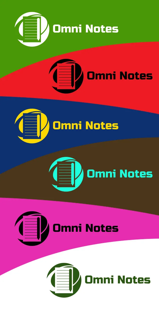
The present proposal has been made with the purpose of modernizing the existing logo in the Omni Notes application, the main icon is represented by a circle that involves a note generating movement and the feeling of encompassing everything.

The typeface used was RUSSO ONE
https://fonts.google.com/specimen/Russo+One

By using a logo with better graphic strength the recognition of the application against its competitors will have greater support, the use of two colors generates greater visual contrast.

In the process ADOBE ILLUSTRATOR CS6 is used


Below I share the files in image format and vectors
https://drive.google.com/open?id=1R036lm_dQ9FX-yn4SyO6eVaKZAUm5_p5
Posted on Utopian.io - Rewarding Open Source Contributors