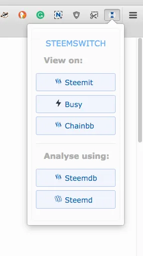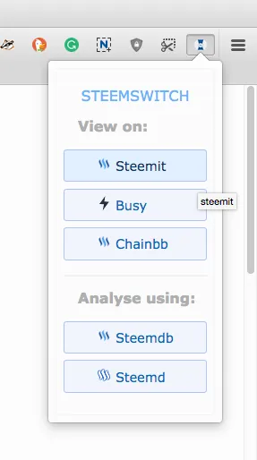
I want to share with you the preview of a new menu ready for the next SteemSwitch release. It's my own design with the exception of a background colour change on hover, added by @antonchanning.

I am happy with the progress on this so far. I enjoyed playing around with CSS until the menu began looking clean, readable and stylish. I looked at different menu designs in my own browser to compare different functionalities and looks and took inspiration from there.
I noticed that pale greys strongly dominate. I decided to use it for the main background but make the buttons bluish to make them stand out and look more distinct. Darker blue on hover, added by Anton, emphasises this effect. I like it.
I might want to add greyed-out icons for options that have no logo, Chainbb and Steemdb, to differentiate from the steemit.com logo. I may also do some small improvements to the SteemSwitch logo. It looks a bit small and doesn't stand out as much as I would like it to.
Thank you for your interest in SteemSwich development.
Posted on utopian.io
