Yep, I'm one of those people that misses Windows 8. I'm sure I'm not alone, but I do acknowledge we are in the minority.
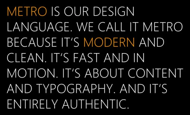
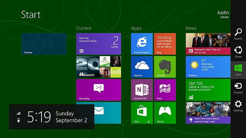
When I first saw Windows 8 demonstrated on a tablet by Jensen Harris, I was floored. THIS is what I want on a tablet, but he made it very clear that this was the new personal computer experience. That was a problem as no one was asking for the desktop experience to change. Personally, I had no problem with any of it, again, I was in the minority. What that demonstration showed me was a fantastic tablet user interface, one that was superior to Apple's iOS. At the time, the design language Microsoft was using was called Metro. And I loved every bit of it. I was already on board with Windows Phone 7 so a similar interface on a bigger screen was cool to me.

After seeing that limited demo, my thought of what Windows 8 was going to be was for new 2-in-1 devices to have a tablet interface when it was held, but switched to a Windows 7-style user interface when it was docked on a desk, automatically. When I mention "Windows 7-style" interface, I mean a Start Menu, not Start Screen. That almost happened after ALL the updates and upgrades to Windows 8, but Windows 8 never quite achieved that, because it was so very incomplete when it hit the market. Windows 10 does do this, but Microsoft didn't bring the tablet experience from Windows 8 over to Windows 10. Instead, we got some the same desktop experience, but with bigger icons, more touch friendly. Not what I wanted.

Again, if Windows 8 functioned like that from day one, if the Start Menu was present in desktop mode, if the messaging was this then Windows 8 would have been accepted, because the tablet experience wouldn't have been forced on the user.
I will write another post soon about why I prefer Windows 8 to both Windows 7 & 10.

