I just realize that Steem Community is hosting a thumbnail and banner design.
In the beginning, multiple of scratching on my notebook to figure out how to meet the requirement as below:
| Clean | Elegant | Uncluttered | Trim, but stylish | Clear color scheme | The right size! |
|---|
Righteous was created by Astigmatic who initially inspired by the all capitals letterforms from the deco posters of Hungarian artist Robert Berény for Modiano. Grid based and geometric in execution, the letterforms are highly readable at a range of point sizes. Unlike that of the inspiration source, Righteous has a full lowercase to increase flexibility of use.

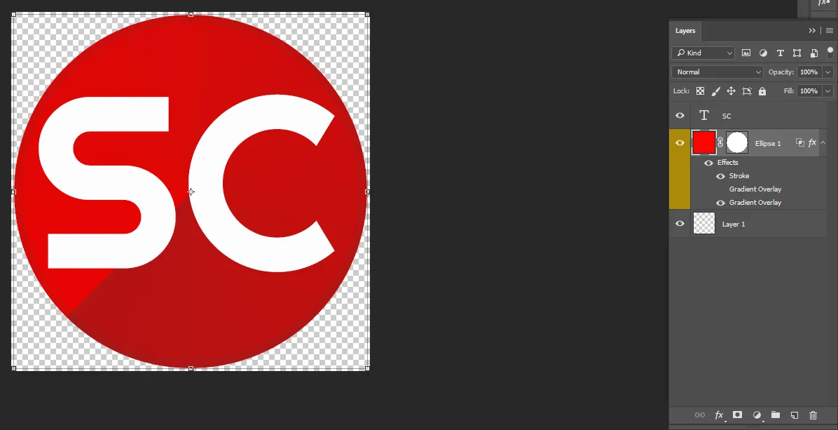
Without further delay, I start to design the logo first using a primary color of red and white. The logo icon was simple with the character "S" and "C" combination. The character will be white meanwhile the background will be red. A solid stroke layout to enhance the circle border in fx style setting. In addition, using the fx style setting to add the gradient overlay to make it stylish. The angle setting for the gradient background is -135 degree.

The final result look simple but it actually take hours to create it since multiple adjustment is required to fine tune the design.
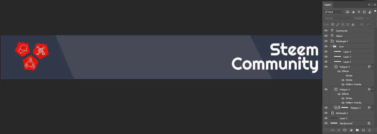
Meanwhile, as I still struggle to figure out what is the suitable dimension layout for Steemit, someone posts an example which is a perfect match for it. The closest dimension for the banner was 1440 x 192 pixels.
It looks just nice on the desktop. The color I was thinking for the background was dark blue but I end up using dark grey-blue. The layout is simple and clean using the rectangle with some adjustment to enhance the background. As for the left side icon, it was a pentagon shape with a red background by using some pattern to make it look different.
The white icons was made by Skyclick Image Source for from www.flaticon.com is licensed by CC 3.0. The "Steem Community" wording is using the same font style as the logo. A minor adjustment to the icons and wording due to the banner was cut off when uploaded on the cover image.

The Steem Community banner looks just nice and fit for the contest. It even looks good as a signature for this post. I just hope they will use it since it is a Legend Chew creation after all.
Posted from my blog with SteemPress : http://www.legendchew.com/steem-community-thumbnail-banner-design/
