Whats up my fellow Hivelings,
On this point forward I'm gonna be using PeakD to post my future fanart. So without further ado lets gets started.
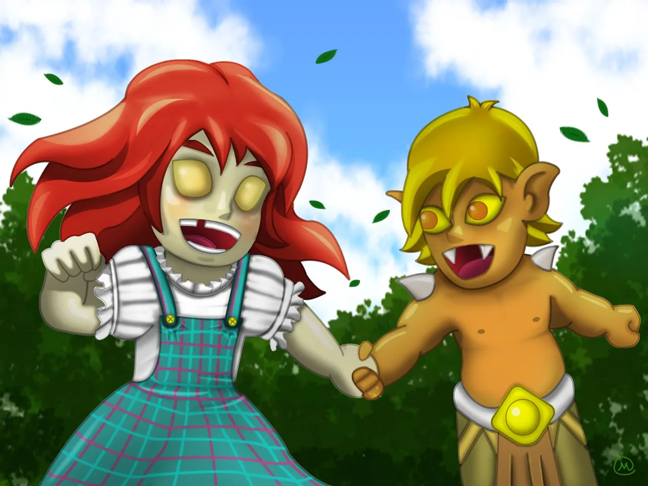

Inspiration
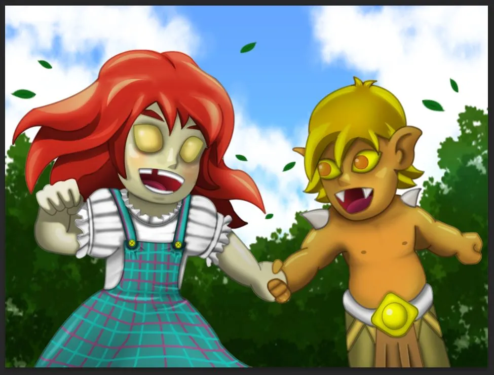
I got my inspiration for this fanart after I finished watching a certain anime titled Ranking of Kings, if you like watching anime too then I strongly recommend you to watch this treasure. It was very well written and the plot twists are sensational. Anyway back to my illustration, I used 2 card as my subject.

Element: Fire
Role: Summoner


Process
Since I was already doing full illustration on my past entries, I thought 2 subject will not be an issue for me anymore. Unfortunately I guessed wrong XD because it almost take me a hundred layers to finished this in photoshop.
Below were the steps.
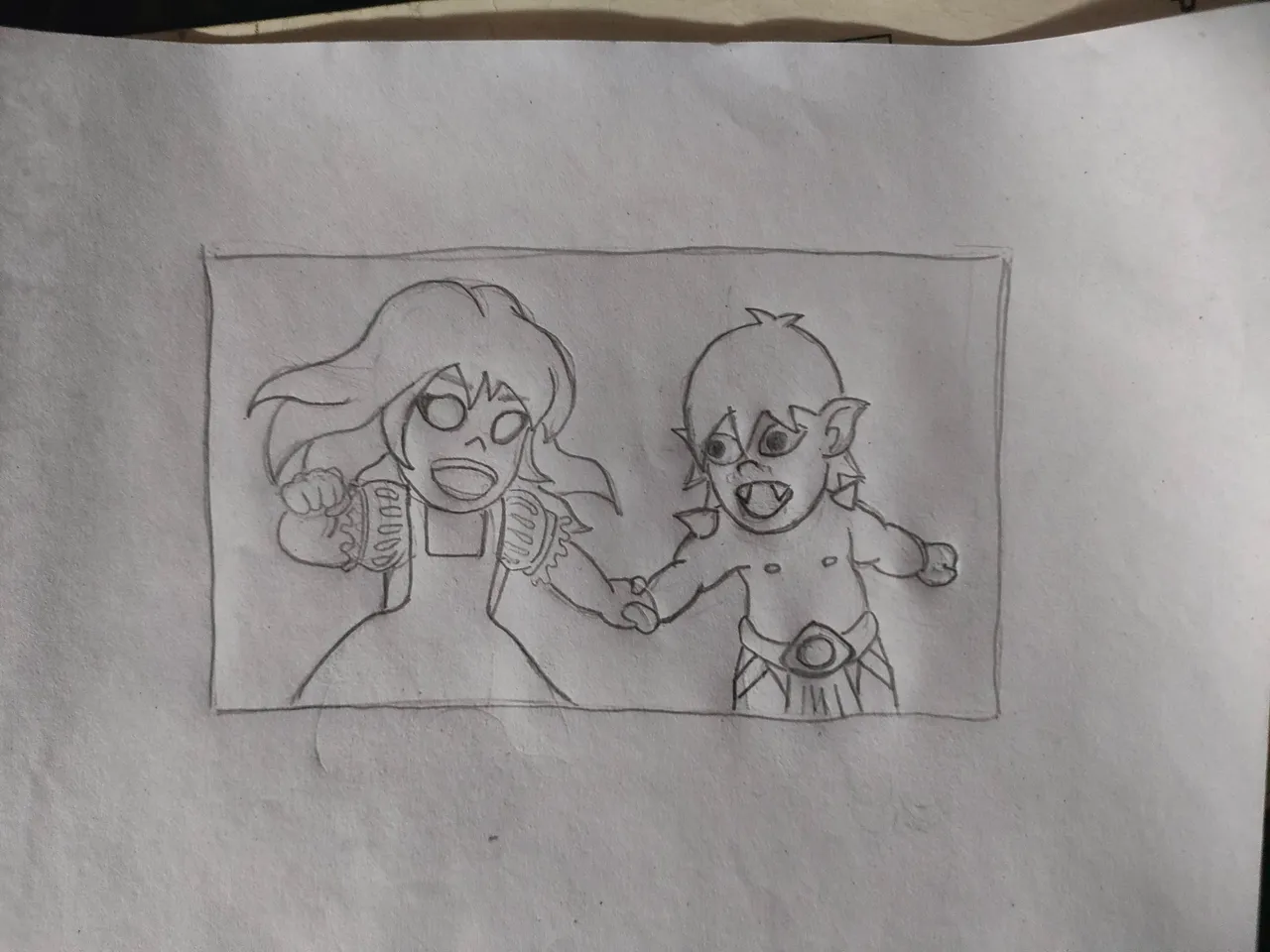
Drawing
Of course every one of my illustration always starts with a drawing.
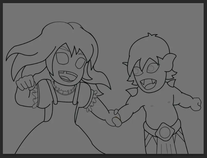
OutLine
After the drawing I just traced the drawing to create the based line art for the illustration.
Colors
Next step will be the flat colors, I based the color based on their respective subjects.
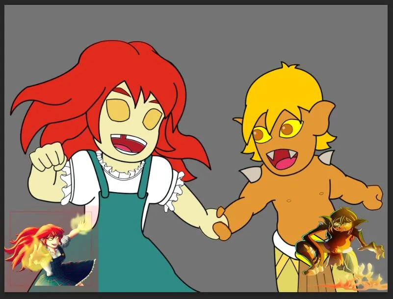
After these 3 primary step we can barely see the outcome of our drawing. So we can now proceed to advance set of steps.

Shading
For me shading was the hardest part of the process and since I'm not too experience with digital art, I'm still experimenting ways on how to properly shade my drawings, For now I'm categorizing them as 3 parts.
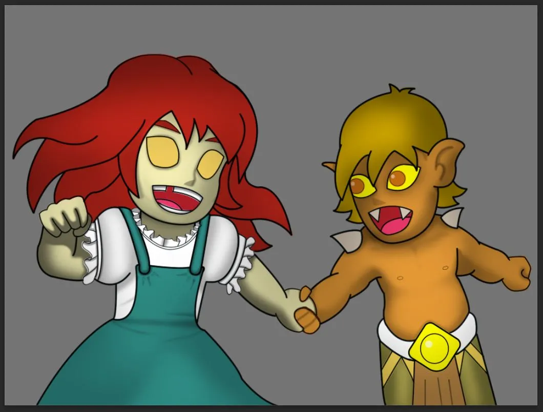
Big Shading
Shading the subjects as a whole.
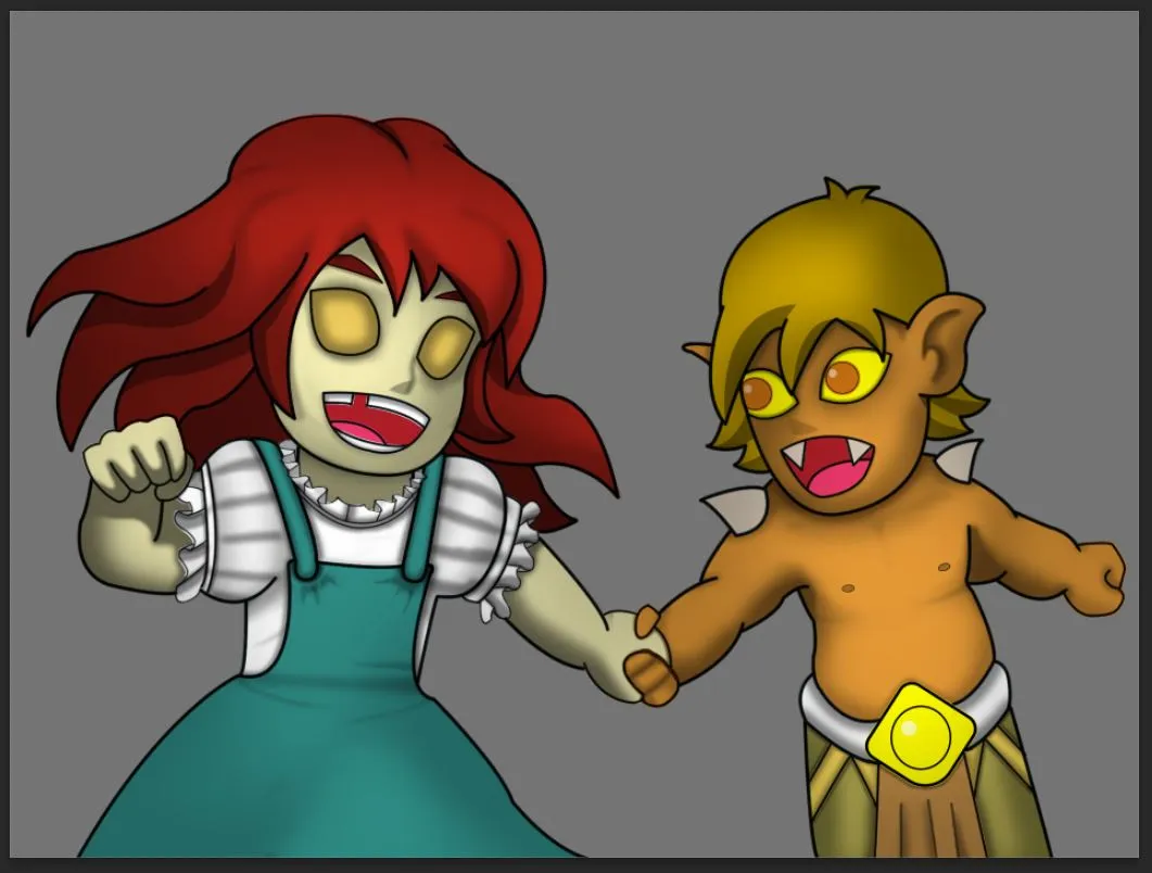
Medium Shading
Shading the subjects shape by shape. On these part I also add the hard shadows
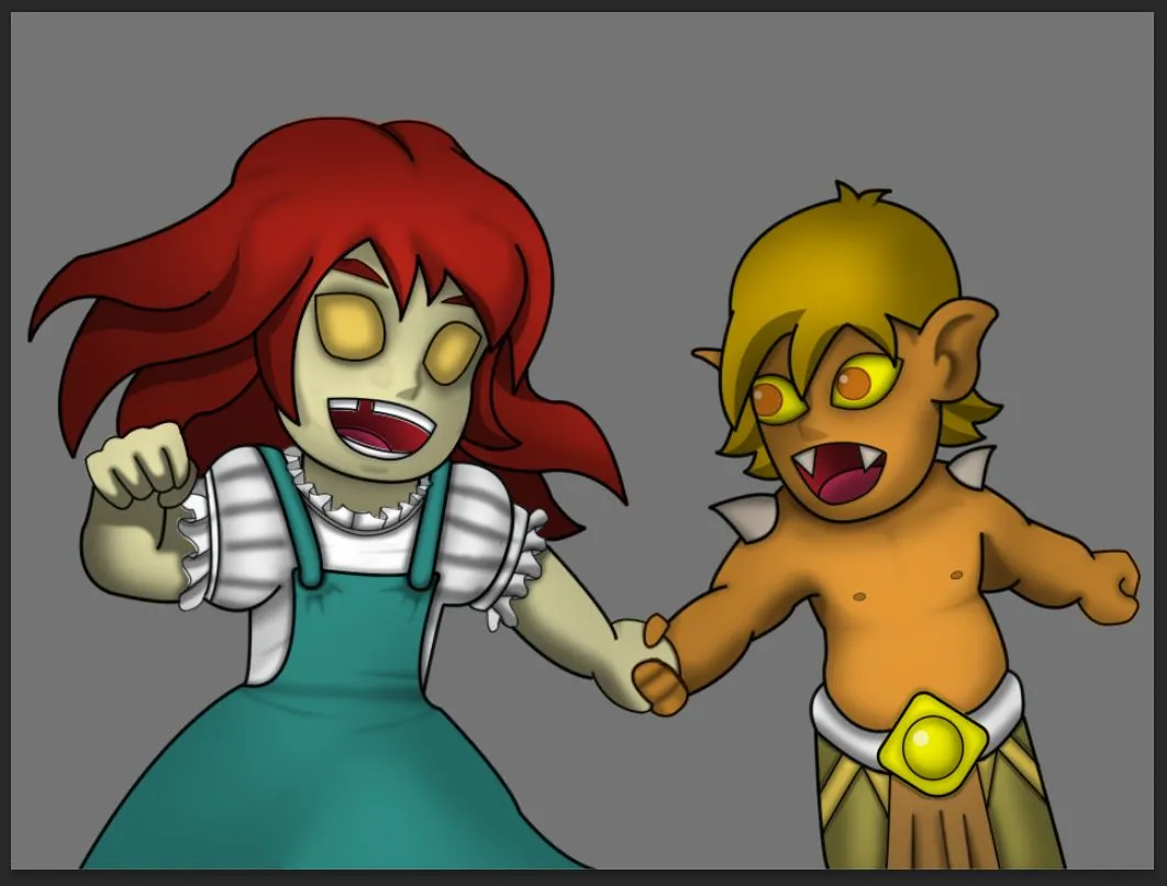
Small Shading
And lastly shading all the small details

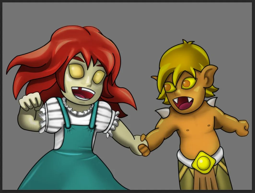
Highlights
Of course after doing the shadows we are now going to do the opposite step which is the lighting. For lighting I am categorizing them as 2 parts only.
Soft Light

Hard Light

Alright were almost done, We just need to do some additional details on our subjects before we can proceed with are final phase of the process.
Additional Details and Fixes.
following are the list of adjustment I've done on this part
- Adjusting the opacity of the LineArt
- Adding blush on Tarsa's cheeks
- Button on Tarsa's Jumper
- Since for Tarsa's original design, there are lines on her clothing, So I add them too.
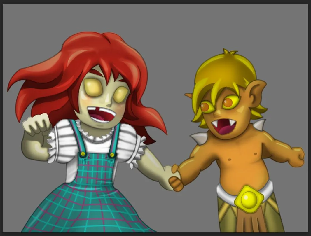
At last were done with the subjects, Lets go and finish this thing.

Background
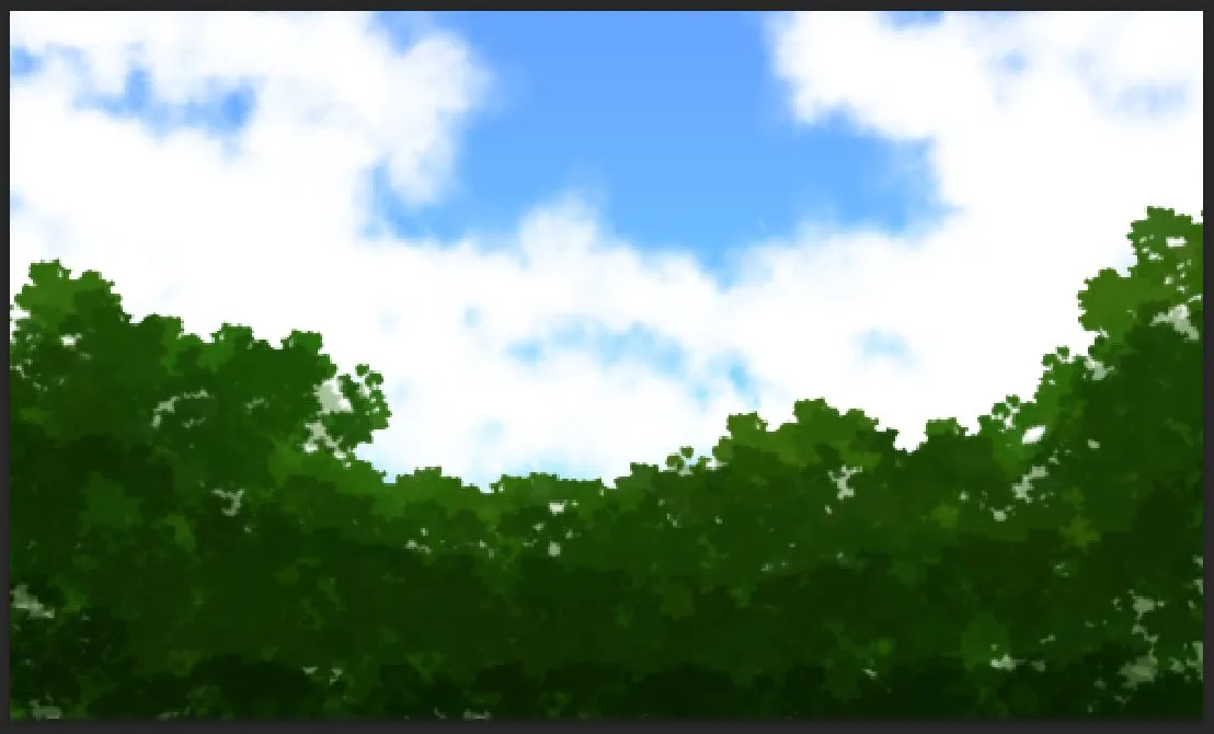
Since the subjects were already too big, I Make the background as simple as it can be using different shade of Bush brush, Cloud Brush and a gradient sky.
Putting the subjects on the background I created.
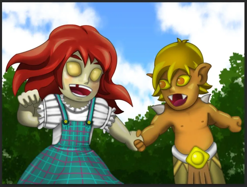
To compliment them I add some highlights on both subjects.
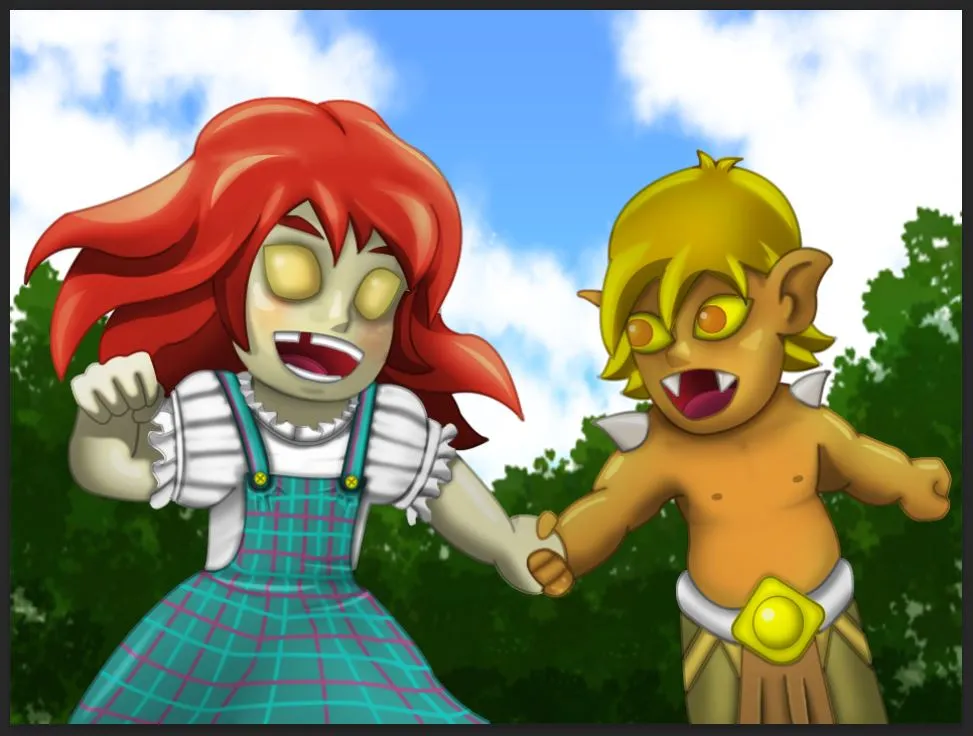

Final Touches
Were almost there, We just need some final touches.
 |  |  |
|---|---|---|
| Adding leaves | Adjusting Pyre's mouth | Adding signature |
Final Output.


All right that's all folks, Hope you like my entry this week. Here are some of my previous posts
Thank you for being awesome my fellow hivelings. Cheers!
