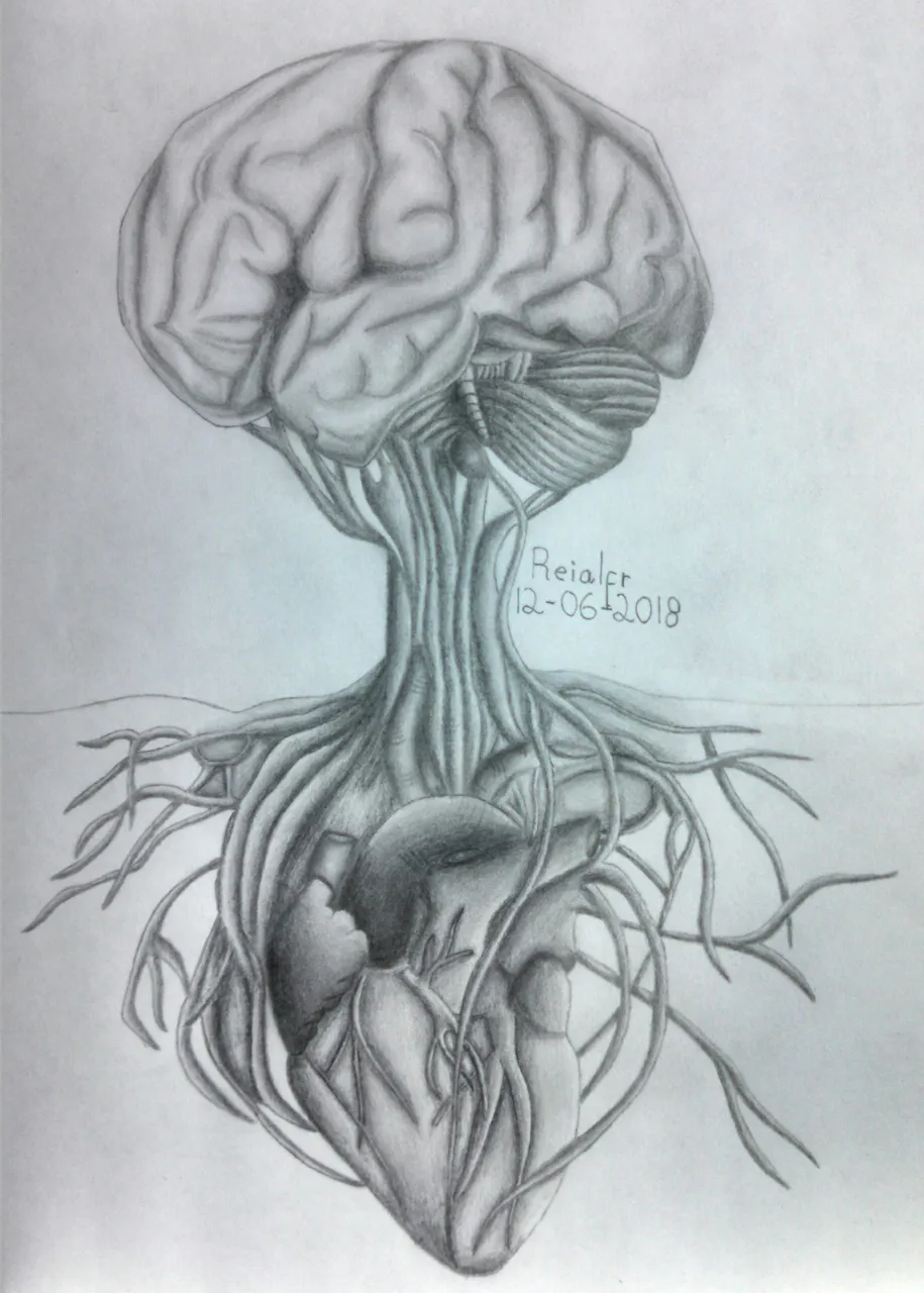
Hello friends of Steemit! The anatomy has been one of the things that since i was a child has impassioned me, every part that makes up the human body is amazing, complex, totally worthy of admiration, that passion was what inspired me to make this drawing and try to make it that as realistic as possible. In my opinion, the more details are added, better the final work will be even if implies that increases its difficulty, is for this reason that i like to dedicate most time to each drawing.
Now, let's start:

Materials:
-Paper
-Pencil Graphite HB and 2H
-Draft
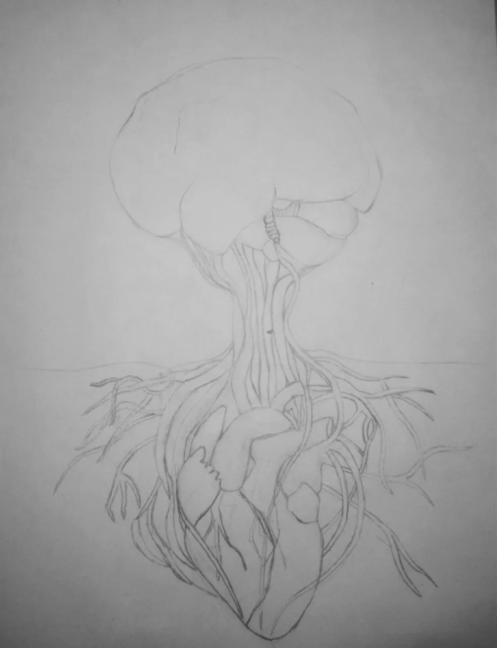
- Step 1: In the anatomy drawings is very important that before starting, we study well the characteristics of the part of the body to be made, to achieve a quality work.
Is of interest to correctly make the edges of the brain but in its internal details there are usually variations, that is why we can use our criteria in some areas. On the other hand, with the heart if is necessary to take good care of both internal and external details, each part should be as close as possible to a real heart.
Those cylindrical forms that unite the brain with the heart are the nerves and both their shape and distribution you can draw it them to their creativity.

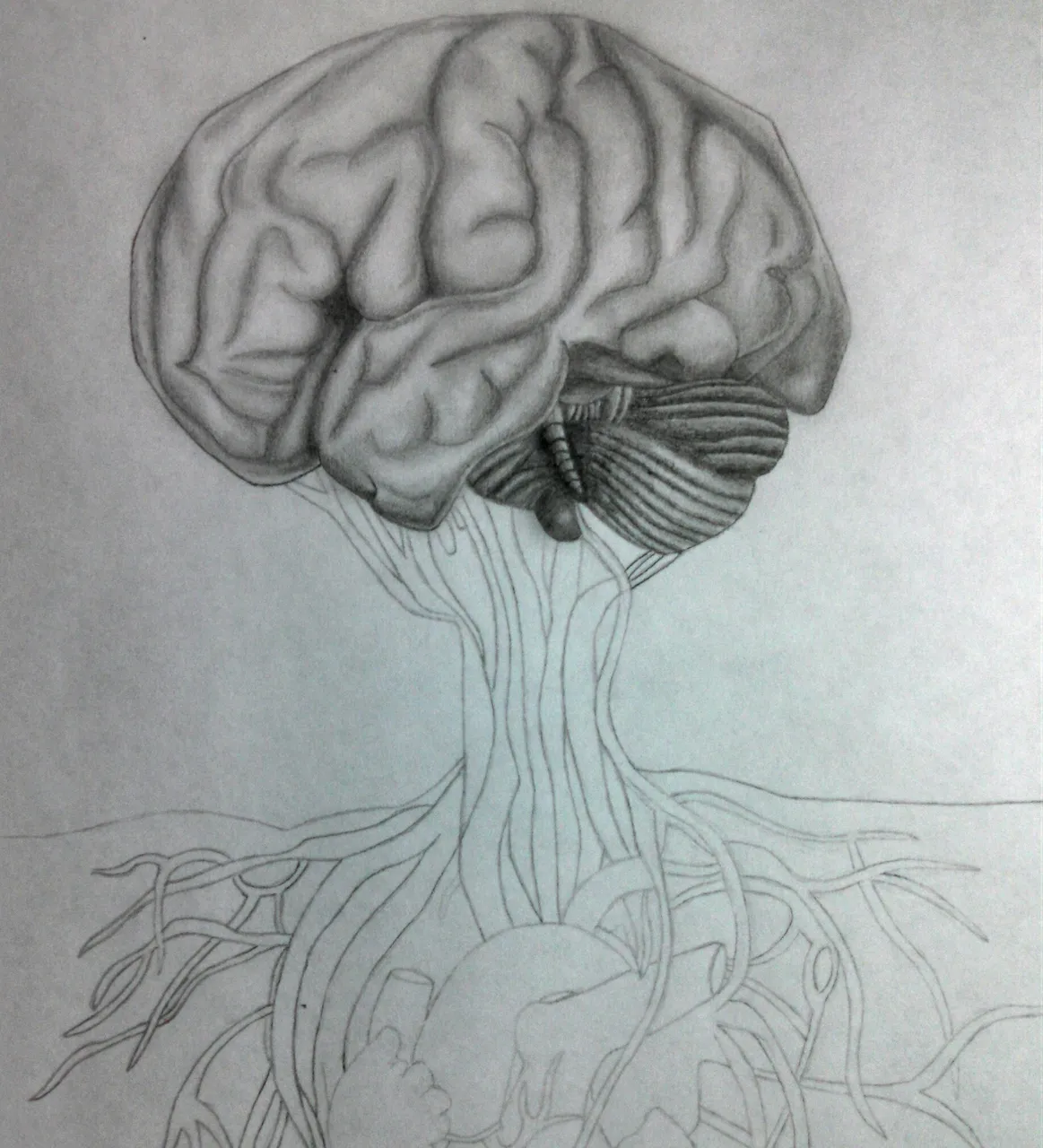
- Step 2: For shading we must locate where want the light to come from, either on the left or on the right and thus know which areas darken more. To add this effect of depth or 3D in the inner part of the brain we perform an intense shading on both edges of an area and we create a gradient so that in the center we have a white space, which will be our tone of light. For the cerebellum that is in the lower part of the brain, a more intense shading should be created, with a darker tone in the center and that degrades as it approaches the exterior.

- Step 3: The nerves have a cylindrical shape so their shading is done in two ways based on where we want the light to come from. If the light comes from the left or right, we must mark much more one of the sides and will make a degrade until leaving the space that corresponds to the light but in case it comes from above, we should mark the right and left side of the geometric shape and in the middle is where will leave the space of light.
The heart has a relatively simple shading, what we must take into account is that above it there are some nerves and arteries, so to create a more realistic effect, we perform a more marked shading under them to create the impression that is a shadow

I would like to know if any of you liked my tutorial ✍, if so, tell me in the comments... In advance, thanks for supporting my tutorials. 😉
Greetings, steemians 😃!!