Want to learn to take advantage of surging or falling cryptocurrencies?
Introducing the Ichimoku...
If you want to invest in or trade cryptocurrencies, a powerful predictive tool that has been overlooked is Ichimoku Kinko Hyo.
BACKGROUND
I worked at a proprietary trading firm in the City of London for 4 months trading the majors (GBP-USD, EUR-USD and other major currency pairs).
I loved learning about the techniques; particularly Fibonacci sequences and Ichimoku. But the most important and reliable method I learned was Ichimoku Kinko Hyo.
With this technique I was able to put on a very good trade that made me $1,000 in a night when working at this firm... but the pay structure of this job was such that I had to make a certain amount before getting commission... In the end it didn't work out for me on various levels, so I left.
The Ichimoku Kinko Hyo method originates from Japan and has been under-utilised by professionals in the West due to the lack of translation and guidance on how to actually use it, with most dimissing it as an exotic indicator.
It is only in the past decade or so that Westerners have started to understand the power of Ichimoku Kinko Hyo.
This indicator works very well for BTC-USD and other cryptocurrencies, as well as working successfully for Asian traders trading in stocks, commodities and futures. Ichimoku Kinko Hyo translates into English as 'equilbrium chart at a glance' ...it does what it says on the tin!
You can take a quick glance at the chart and immediately find the balance point, or 'equilibrium zone' for the asset in question. Invented by Goichi Hosoda, a journalist, he released the Ichimoku system to the public in 1968 after he recruited a group of students to run simulations by hand to test the system for two decades.
OK... but what does it do?
The Ichimoku system allows you to identify breakouts and jump on an ongoing trend. Moreover, it can give signals to enter trades and allows you to gauge momentum.
While the indicator is made up of four components, they all must be assessed relative to the market price to understand what is going on in the market. Use the components jointly to form an integrated whole picture of price action that can be realised by just a glance.
At first, using this indicator can be daunting but after a while it becomes very easy to use. You will then have an almost instant understanding of the strength of the current trend and momentum.
When using the Ichimoku Kinko Hyo, think in terms of equilibrium and disequilibrium. Since the market is a composite of all individual, human traders, the market is a reflection of group behaviour. Just as you cannot stay happy or angry forever, we must return to the mean, so does the market.
This brings us to the Ichimoku cloud or 'Kumo'.
1. The Ichimoku Cloud or the 'Kumo'
The first component that will be detailed is the Ichimoku cloud (or 'Kumo') which represents the equilibrium zone over time. If the price is inside the Kumo then we can say the market is in equilibrium;
Equilibrium... the state of a system where there are two equal, opposing forces such that the system is stationary. Therefore, when the price is within the Kumo we should look for a breakout of this equilibrium as this will give an early entry into the most likely future direction.
Examination of the Kumo will also allow you to realise two things; the overall trend and the price's relationship to that trend. Moreover, it provides a multi-dimensional view of support and resistance. This is an improvement over the simplified, linear view of traditional support and resistances at certain level. Instead, in reality the dynamics of the market causes support or resistance zones to expand and contract.
Kumo breakout
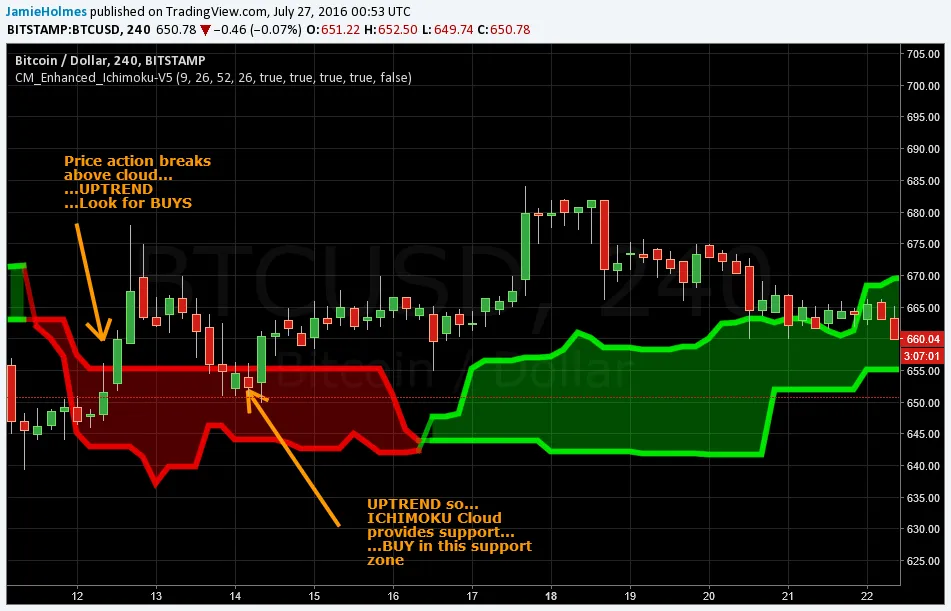
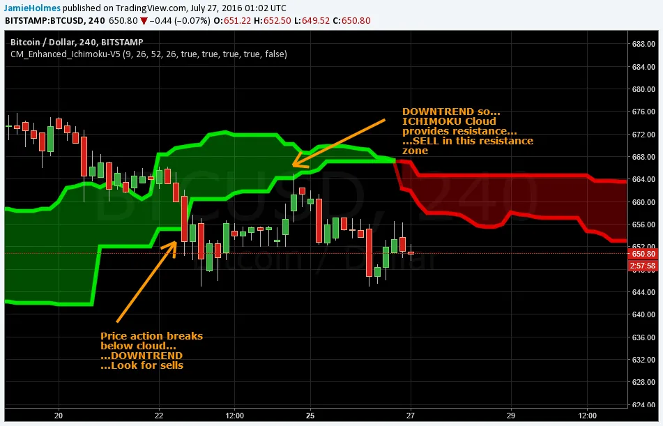
If the price is within the Kumo, the market is trendless. If the price is above the Kumo, then we have an uptrend whereas if the price is below the Kumo we have a downward trend. For example, the chart below shows the 4-hour price action for BTC-USD along with the Ichimoku cloud/Kumo. In this instance, we see that BTC-USD breaks above the Ichimoku cloud during the 12th July 2016, which is also known as a 'Kumo breakout'.
This gives a bullish signal and we could have entered into a buy position once there was a 4-hour close above the Kumo. However, a smarter strategy is to wait for the market to test the support zone provided by the Kumo. Generaly, if the price is above the Kumo, then the Kumo will provide a zone of support. On the other hand, if the price is below the Kumo, then it will be a resistance zone.
After breaking above the Kumo, the chart below shows that the market pushed down into the Ichimoku cloud. However, this is the time to buy as the relationship between the price and Kumo is signalling an uptrend and the Kumo currently providing support. Buy positions would then be suggested. Following the push into the cloud, the market found support inside this zone and continued upwards from ~$650 to a high near $685.
Buy signal - Kumo breakout
Sell signal - Kumo breakout
Below you can see the same thing but for a breakout to the downside.
Multi-dimensional support/resistance
So we have looked at the signals the Kumo gives for identifying the start of a trend but it also gives a multi-dimensional view of support and resistance, as mentioned earlier. For example, consider the chart below. This was BTC-USD back in May 2016.
As you can see below, the depth of the Ichimoku cloud varies widely over the course of around two weeks. The depth is an indication of market volatility and hence the extent of support or resistance that will be found in this zone.
The thicker the Kumo, the greater support or resistance it will provide. The thinner the Kumo, the weaker the support or resistance will be. Ths can be seen below where a thin Ichimoku cloud was easily broken by the market. Therefore, we are more likely to see the price change its realtionship with the Kumo when the Kumo is relatively thin.
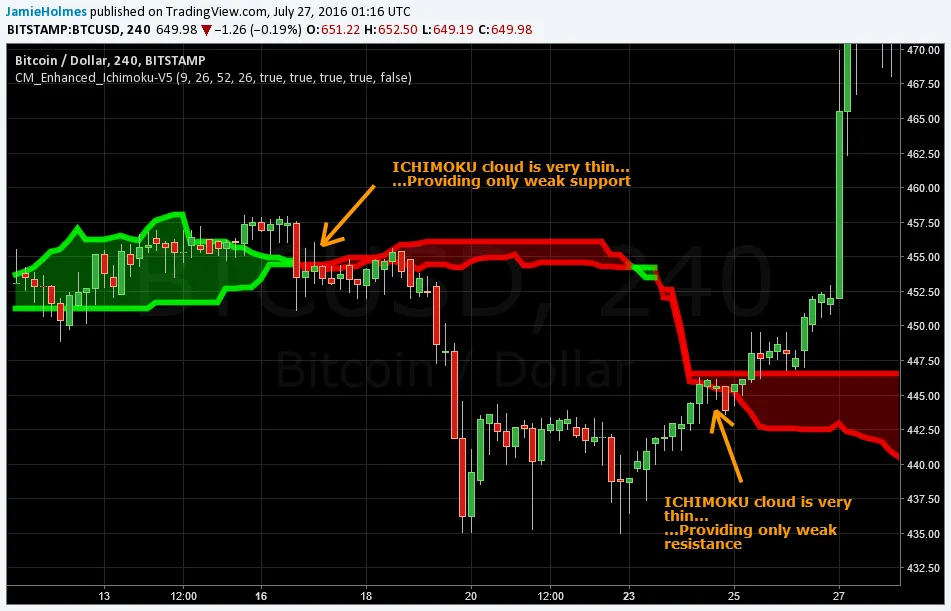
Moreover, clues about the current and future trends are provided by the change in the colour of the Ichimoku cloud. For example, in the chart above when the Kumo turned from green to red, this was warning us of the impending downward move that broguht BTC-USD as low as $435.
Therefore, when the Kumo starts to change colour we should be ready to take a position.
2. Tenkan Sen or 'base' line
The Tenkan Sen is the average of the highest high and lowest low over the previous 9 periods and consequently better capture's the market's equilibrium and points of support/resistance than a simple moving average.
When the Tenkan Sen is flat, it indicates a trendless condition in the market over the past 9 periods. When it is not flat, the angle indicates the relative momentum of the price action over the previous 9 periods. If the price is above the Tenkan Sen it will act as support. Conversely, the Tenkan Sen provides resistance when the price trades below it. But given the short-term nature of this component, it is not as reliable as the other signals in the system. Nevertheless, the price crossing over the Tenkan Sen is usually a good indicator of a shift in momentum.
For example, if the price action breaks above the Tenkan Sen this signals a shift to upward momentum. Whereas if the price moves from above to below the 'base' line this indicates a higher likelihood of downard momentum over the short-term. However, as with all Ichimoku signals, this should be evaluated against the other three components.

3. Kijun Sen or 'conversion' line
The third component is the Kijun Sen or 'conversion' line which is the highest high and lowest low averaged over the previous 26 periods. The Kijun Sen essentially works in the same way as the Tenkan Sen but since it covers a longer time period, it is more accurate at determining momentum and support/resistance. Two main signals are given by the conversion line...
This is illustrated in the chart below which shows that the conversion (blue) line gives a tighter level of support and resistance and a more accurate depiction of price equilibrium. Also, notice that when the conversion line is flat, the price action is attracted to it and we experince the 'rubber band' effect. The price rotates around this equilibrium level swinging away then back towards the Kijun Sen. Therefore, we can buy/sell if the price is significantly lower/higher than a flat conversion line.
Another signal is the crossover between the Tenkan Sen and Kijun Sen. The chart below displays how to use this strategy.

4. Chikou span or 'lagging' line
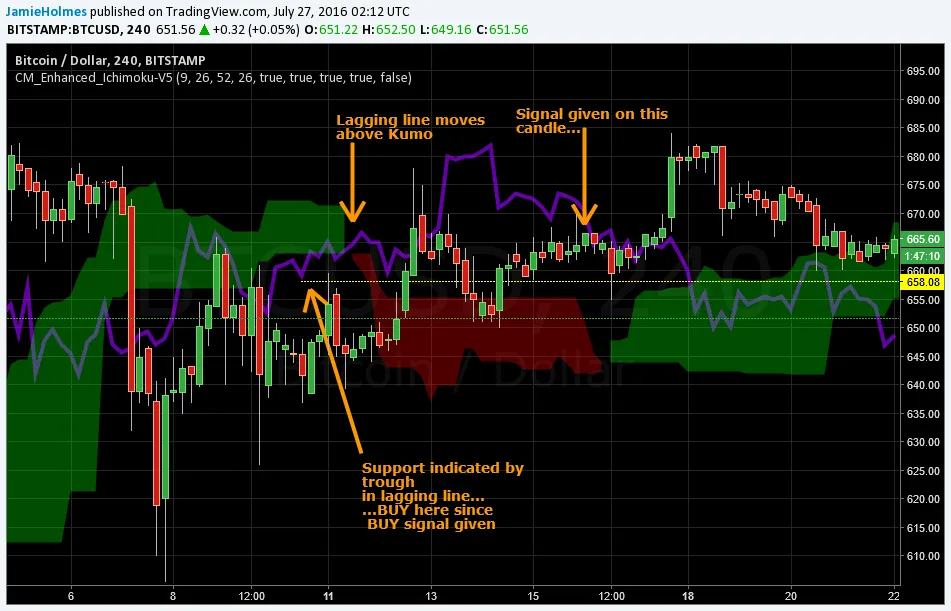
The Chikou span or 'lagging' line is the current price time-shifted back 26 periods. The main signal given is trend confirmation. Once the Chikou span moves from above to below/below to above the Ichimoku cloud, this provides a signal. For example, consider the chart below. The arrow highlights that the lagging line is moving above the Kumo, providing a buy signal. This confirms the bullish Kumo breakout and strongly confirms an upward trend is underway.
Therefore, we use the lagging line to find a support level, indicated on the chart with the yellow ray. We buy BTC-USD when the price touches this level, which it does after 12 hours or so. After testing this support, we see that the upward trend continues. To exit this trade, we would also use the lagging line to determine a resistance area where the upward trend may exhaust itself.
To do this, we zoom back and find the most recent peaks (or troughs in case of a downtrend) and set our take profit levels accordingly. This is illustrated below.
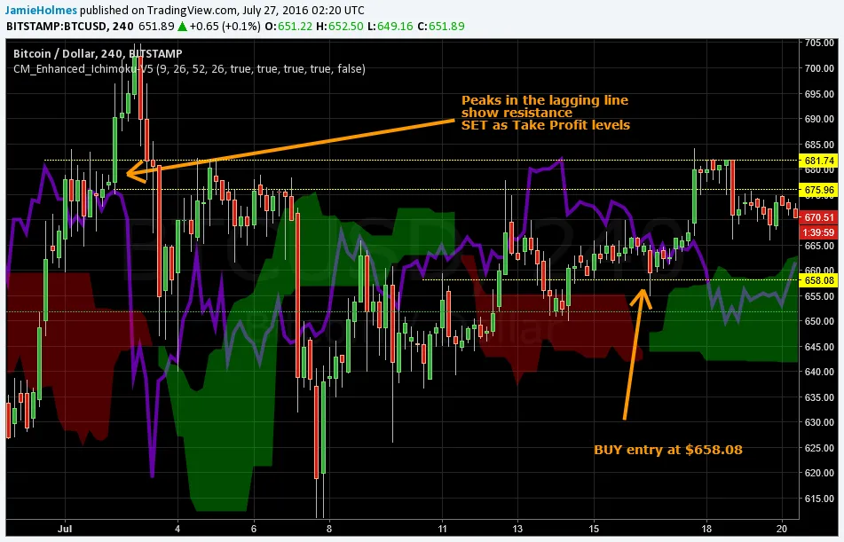
The Chikou span is unconventional in that it time-shifts the current price to compare with the historical price action. If the Chikou span is above the previous price action, then this is bullish. Whereas if the Chikou span is below the previous price action then this points to more bearish action to come.
An integrated picture
Use all of the components together to form an integrated picture. The chart below shows a crossover of the Tenkan Sen and Kijun Sen which provides a risky but highly profitable buy for BTC-USD.
This is further confirmed by the Chikou span when it moves above the Ichimoku cloud.
Also, at this point the Chikou span is also above the previous price. Therefore, the integrated picture points to an upward trend, so we should wait for the market to find support before buying.

Longer timeframes are better, providing more reliable signals such as the weekly, daily and 4-hour. Shorter timeframes generate too much noise and provide less reliability and more opportunities for fake signals. This method is based on probabilities and back-testing can give you a better indication of the risk you are taking when acting on various signals... I personally like to wait for confirmation and execute lower risk, lower reward trades.
Also, you can combine this indicator with volume to generate a richer outlook. One disadvatnge is that the Ichimoku system can be hard to get your head around at first and takes some practise. Also, a further disadvatnage is that it does not explicitly state where to put a stop loss so you have to also find out how much risk you are willing to take and whether or not that risk is justified.
Hope you have fun learning Ichimoku while trading/investing in crypto's!
It will allow you to get a better entry when you want to buy Bitcoin, Steem or other crypto's and even allow you to switch between coins to take advantage of appreciation or depreciation.
Any questions, I'll be happy to answer...
#steem #originals #trading #investing #cryptocurrency
