When browsing different websites, you are likely to notice the icon with triple bars located at the top right or left corner of the webpage, especially when you are using smaller screens.

Well, these are called Hamburger Menus. They are used to display navigation links on a website, mostly on mobile devices.
If you are not using an icon library, you can create a basic menu icon with CSS.
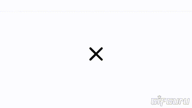
Once the icon is clicked, a sliding menu would usually appear, displaying on top of the main contents of the page. When this happens, the icon changes to an X which when clicked, hides the menu again.
Being always curious about how things are made to work on the web and also because I love playing with code, I thought I should try creating mine and getting it to animate too.
I actually tried doing this sometime in the past but then, I knew just little HTML and CSS and I thought using keyframes alone would do the trick but unfortunately, it ended up a complete disaster.
Now that I've started to understand JavaScript more, I picked up better ideas and I realized that JavaScript is actually very much needed to easily get it to work.
Here's a little tutorial on how I did mine:
Starting off with the HTML, we definine the structure of our hamburger menu by creating the container div which would serve as the clickable area, and give it the "container" class. Then inside of it, we insert three more empty divs which would serve as the top, middle and bottom horizontal bars of our menu icon. Also we assign them their respective classes.
<div class="container" >

<div class="top" ></div>
<div class="middle" ></div>
<div class="bottom" ></div>

</div>
To style it up with CSS, lets position our container in the center of the page to give the icon the main focus. Then we specify the width which would also define the width of the bars.
.container {
   position: absolute;
   top: 50%;
   left: 50%;
       translate: -50% -50%;
   width: 60px;
}
Now to structure the three bars, we set the width to span that of the container. We also specify the height, background color, margin and border radius. Also very importantly, we have to specify the transition duration so that the bars can transition slowly when the styles are changed.
.top, . middle, . bottom {
   width:  100%;
   height:  7px;
   background-color:  #000;
   margin:  10px 0;
   border-radius:  5px;
   transition:  0.5s;
}
Moving on to styling the "X" form of the icon. We have to specify the 2D animations of each of the bars using translate, rotate properties. The opacity of the middle bar should also be set to zero so that it vanishes while the top and bottom bars are transformed and rotated to form the letter "X".
.animate .top {
   translate:  0 17px ;
   rotate:  -45deg;
}

.animate .middle {
   opacity:  0;
}

.animate .bottom {
   translate:  0 -17px ;
   rotate:  45deg;
}

But note that the icon will take this form only when JavaScript inserts the "animate" class in the container div.
Now let's create the JavaScript function that will add the new class name to the container div and also remove it when the icon is clicked.
function change(x) {
  x.classList.toggle("animate");
}
Then we add the onclick event handler in the HTML to call the function when the icon is clicked.
<div class="container" onclick="change(this)">

<div class="top" ></div>
<div class="middle" ></div>
<div class="bottom" ></div>

</div>
Result:
Your opinions would be very much appreciated.
Thanks for your time!❤️