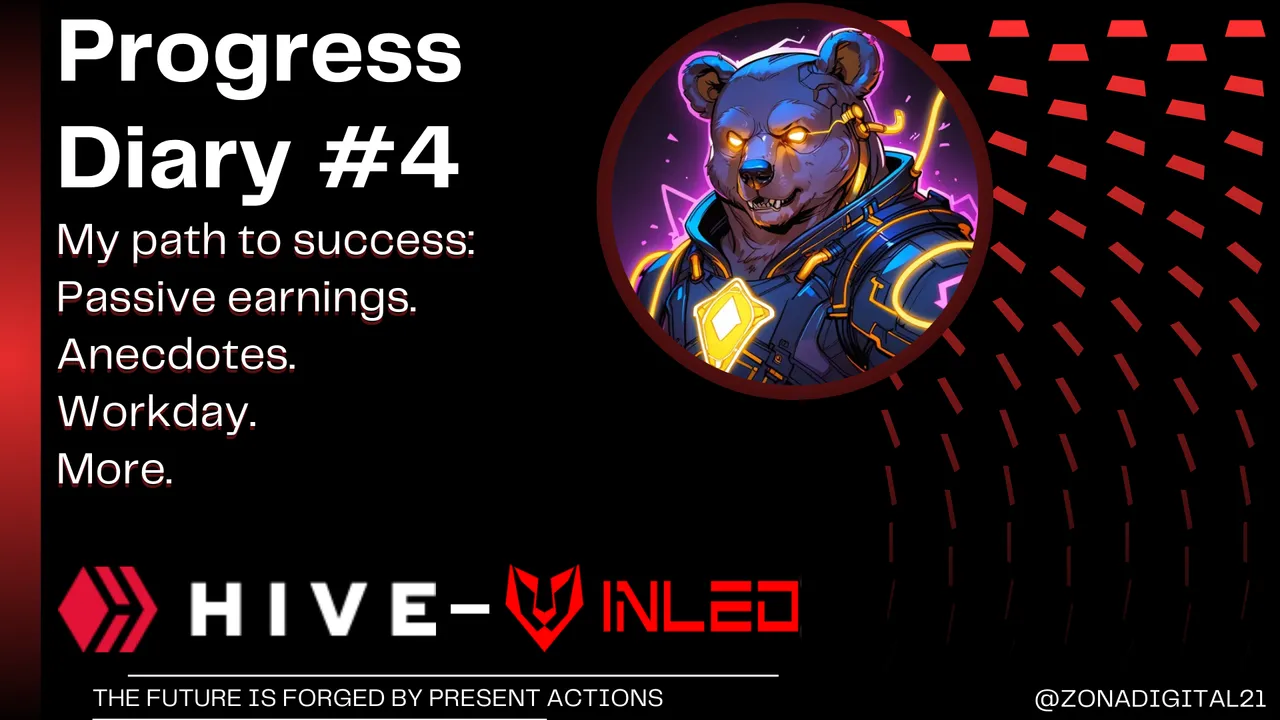
Today I have had a day with some interesting changes, and I want to comment here in my diary, because we have things to talk about, and to start, it has been great to see that new peak that has had the $HIVE, and this was something that many were talking about recently, both in X and in threads, even I have also joined sharing something from my Inleo account, but it happened just what I had said, and that is that this increase in value would not last for long, and that if it goes down a little more compare a few more coins to wait for its real increase, here I leave you an image of my publication of a few hours ago, you can go through my profile to interact with it directly.
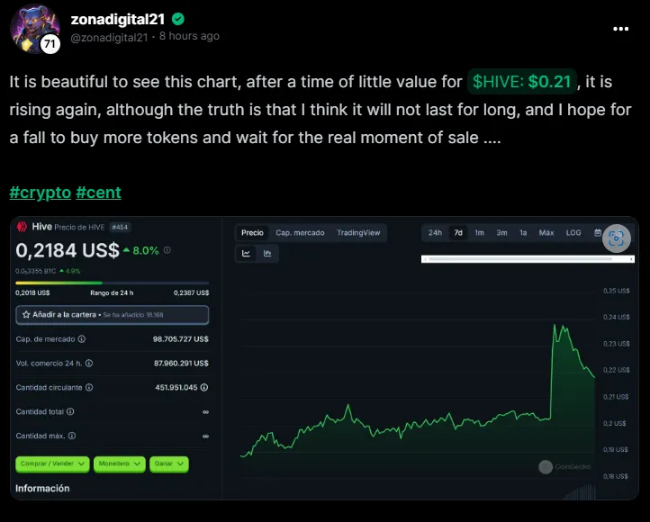
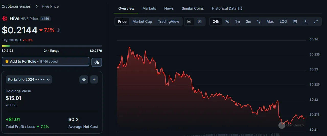
That 8% increase that HIVE had had in 24 hours, has now decreased at the time I am writing this diary, as it is now at 7% lower than a few hours ago, if it goes down again to $0.19 I will consider a new purchase, I know that soon it will take good value, our time to shine will come and that is where I want to make a good profit profit, with a purchase of $0.19 and a sale above $0.30, that would be very interesting.
Here I will leave an image of the current $HIVE chart, let's see how it behaves in the rest of the week, it would be great to know your opinion in the comments.
Now let's talk a little about my workday, and this is where I will explain what changes I have had, and one of the most important that I consider will give a total turn to the business, and is that I have decided to make a makeover to the main logo, although I have little time here as an employee, I know I have made some changes that make everything easier, agile or striking, and with the theme of striking I mean the advertising designs, brand colors and management of social networks.
And at the time I joined this company, the logo they use is something that I really did not like from the beginning, it did not have a marked identity of its own and looked something very simple and sometimes difficult to apply in advertising images, since the logo that has is just a set of letters that make the name (ElectrocelStore).
A simple idea, but does not have a good logo structure, plus if I separate the whole by parts will not be well understood what is the main idea, here I leave an image of the logo or brand of the company.
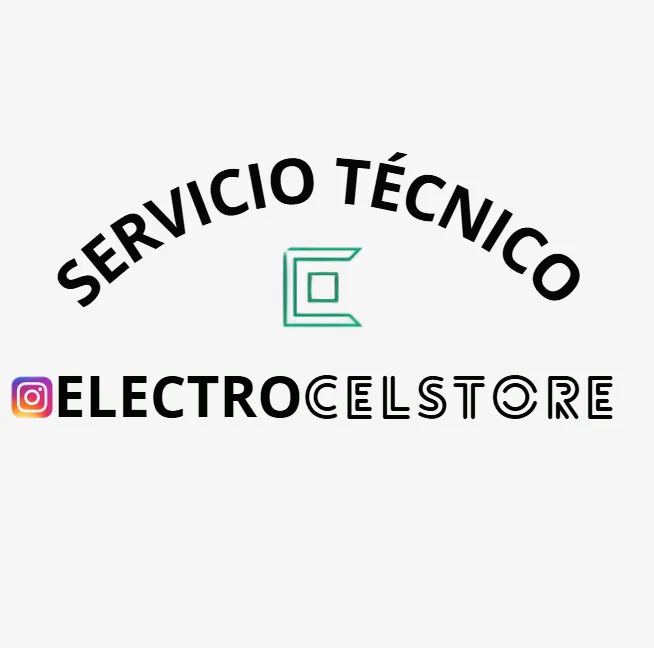
This company has 3 branches, and two of them are focused on wholesale and retail sales of technology accessories for PC, or phone, plus some extra things, but focused on technology, and the third branch is focused more on the issue of technical service or repairs, hence comes the name that is included at the top of the logo, but for my taste, is a word that is left over, unless the local was only for technical service and not for sale of accessories.
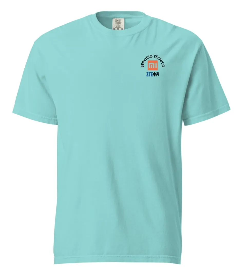
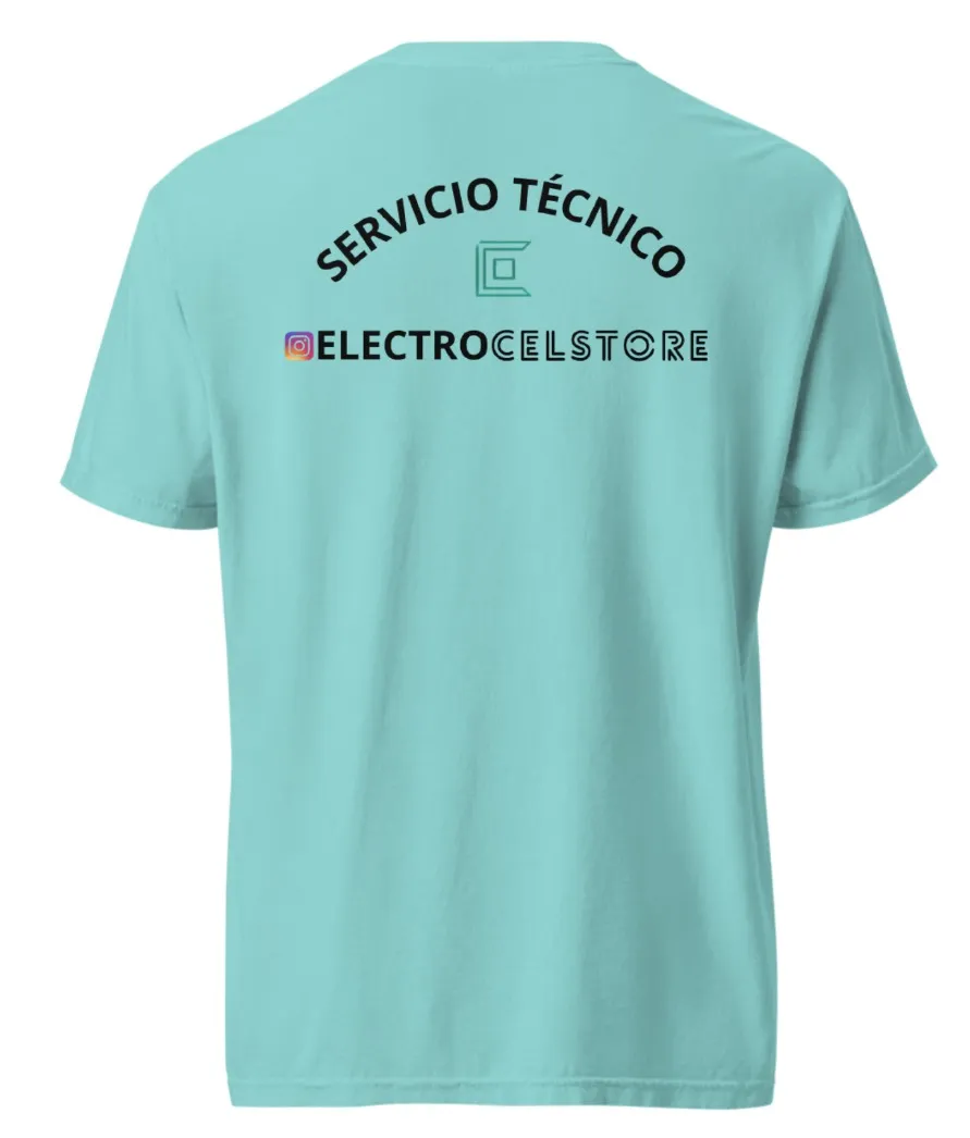
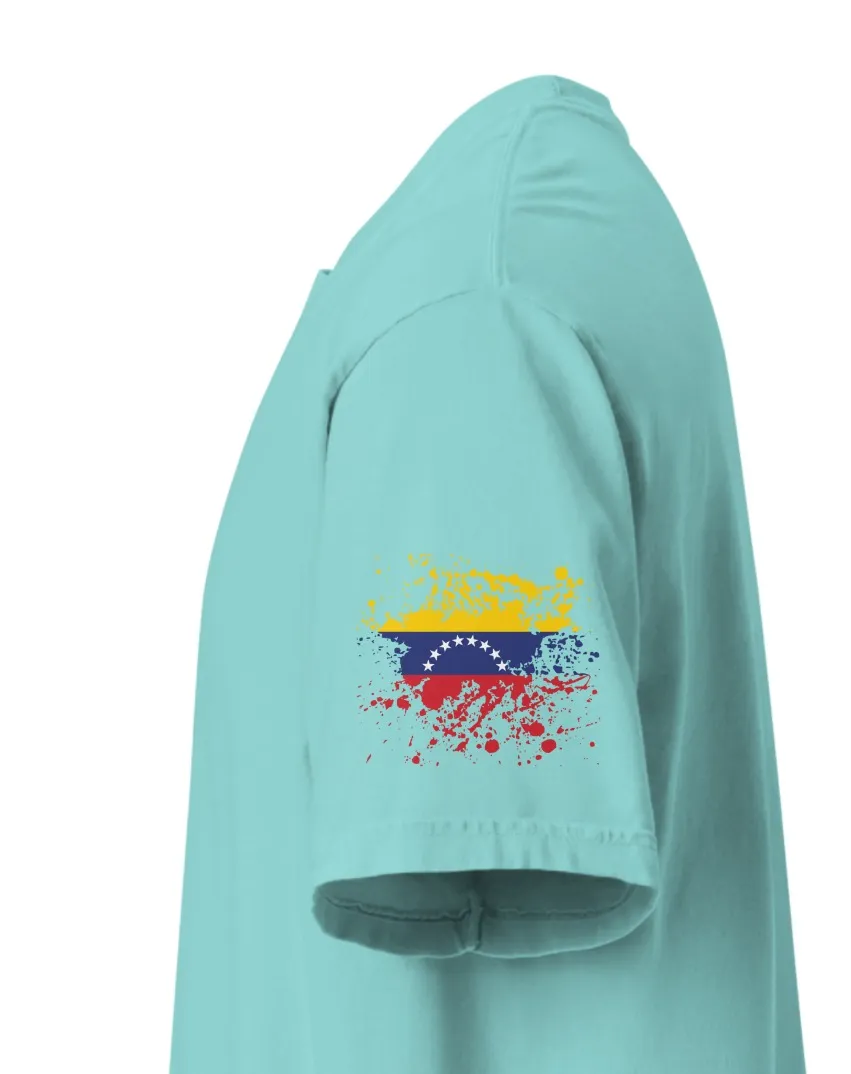
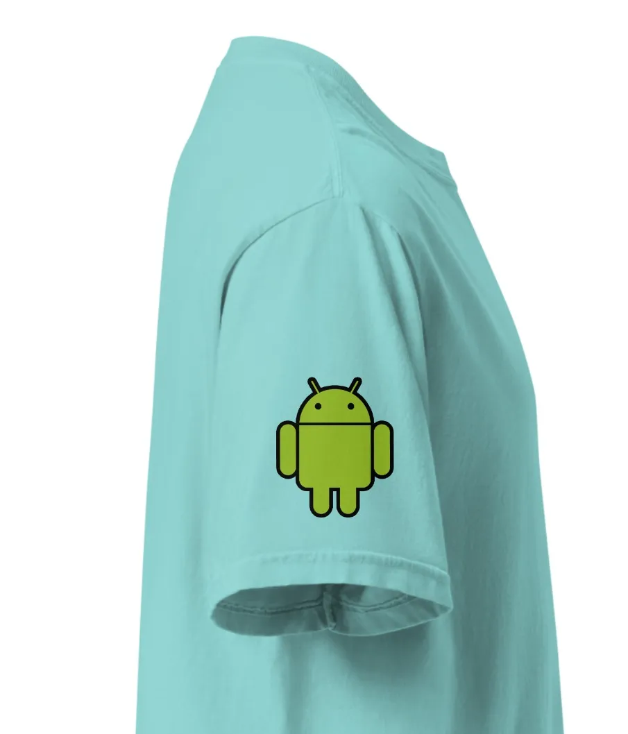
Even so, with that logo I designed the t-shirts that today we are using all employees, and I am proud that this design was mine, but always working with the same brand image, here I leave the designs of the t-shirts we have.
 |  |
|---|---|
 |  |
But my new design proposal is something that according to my taste, is more striking and can really be used as a logo, because it can be easily applied in local products, either in the form of label, seal, brand for social networks, custom products such as caps, or new flannels and more, my main idea is based on the first letter of the company name, ie the letter (E) that will be our logo identifier, something simple, easy to remember, and that when people see it and have time knowing the brand can easily remember that this image identifies us.
In addition to everything, the letter E, has many ways to be applied, and if we hire it well with striking colors will be even easier to remember, in all my editions I have used the green color, a somewhat dark green but with brightness, generating a good contrast with the black and white color, then the brand colors that I have defined are:
- White
- Black
- Green
So taking everything else into account, I have this as the main idea.
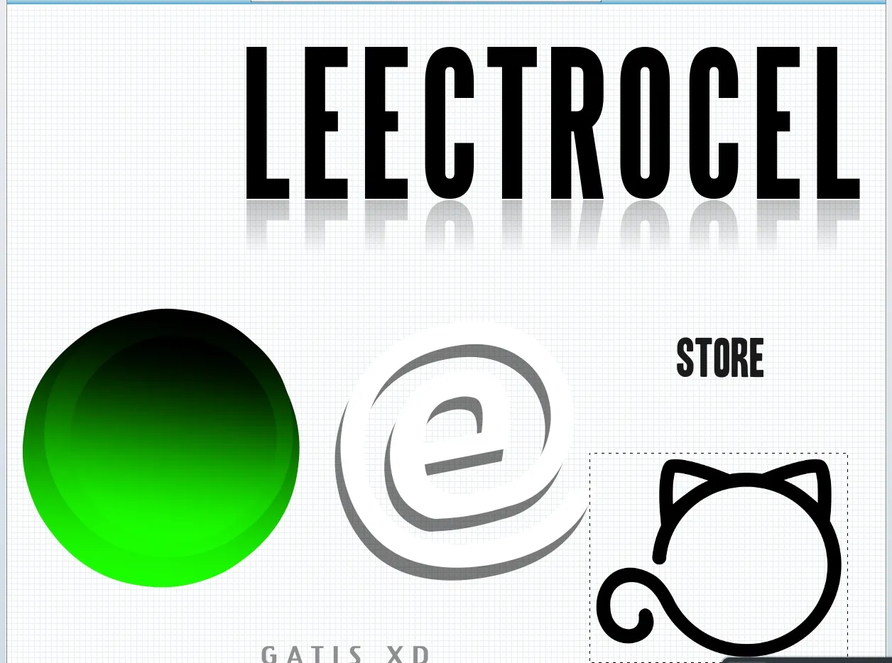
A circle that complies with the colors that I have defined, this will be the main base of the logo, besides that it will be accompanied with a font that is easy to read, and with a mirror effect at the bottom, the main name will be with a bigger size than the secondary name.
The letter E that will be the identifier already has its shape, I like how it looks, and besides that you can see that it has a circle with ears and a cat's tail, this represents something very important that I will tell you in another diary, but then you will see how everything makes sense.
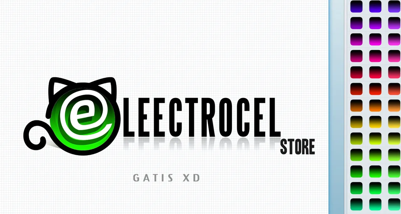
This is almost the final idea, of course I need to fix some more things, for example the fact that the word (ELECTROCEL) is misspelled hahahahahahahaha, but those are minor details, I just wanted to capture the main idea before I forgot it, and guess what? ....
My boss approved the idea of the logo and it will be like this, I just have some things to change, that makes me very happy, because they are really giving me freedom to change many things in the company, and I only have 1 month and 3 weeks working here, but the relationship from boss to employee, that is me, is very fluid and that's great, for now I say goodbye to this day, I will be telling you more in my next diary, I hope you enjoy your working day and have a very productive day and with good earnings.


Follow me on Twitter.
English is not my native language, so I have used Hive Translator...