Hi friends hope you're well today I'm going to show you an eye opening technical analysis and comparison between Bitcoin and S&P 500 to see which one is the best for investment.
A drastic drop and recovery rally:
I would like to take you to the daily chart to see the recent drastic drop in the both markets and the recovery rallies. First if we take a look at the chart of S&P 500 then it can be clearly observed that after strong a bearish move from Feb to March 2020 the price action started a bullish recovery rally. And from the lowest price of March up to the highest price of April 2020 the S&P 500 recovered 34.8%. On the other hand if we take a look at the Bitcoin chart then from the lowest price of March up to the highest of May 2020 the leading cryptocurrency has recovered 161%. Now if we switch back to the S&P 500 chart again then it can be clearly seen that after this recovery rally the price action is not able to move back to the previous level where it was in Feb 2020. The highest price of the Feb was $3393 and after this recovery rally price action has reached maximum up to $2,954. It's mean that the S&P 500 is still in 14.8% loss. On the other hand in the month of February the highest price of the Bitcoin was $10,495 and after this recovery rally the price action has reached up to $10,074. So the Bitcoin is in 4.2% Loss. But this difference is also showing that BTC has almost recovered.

Is this V shape recovery is a call to “kiss of death” sell signal?
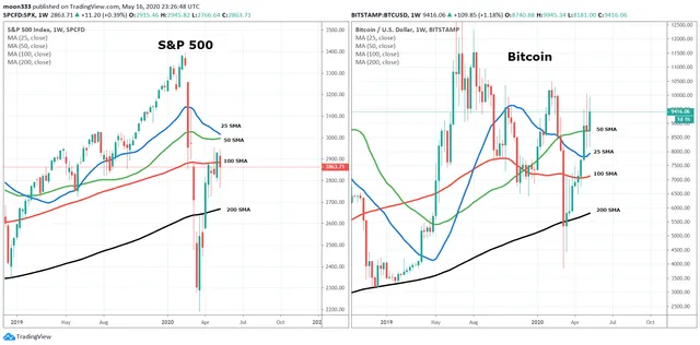
The Bitcoin And the S&P 500 both have the V shape recovery rallies. And among the traders community it is considered in most of the times when the priceline recovers in V shape then it can take another drop to retest the previous low price level. And it is also called a “Kiss of death” sell signal. Now we need to understand how much these recovery rallies are firm and the price action will be dropped back or not. For this purpose we need to place the simple moving averages on the on daily chart of both markets with the time period of 25, 50, 100 and 200. We can see that priceline of S&P 500 has broken out the 25 and 50 simple moving averages but not able to cross up the 200 and 100 SMAs. Now the price action has bigger moving averages at the resistance and the smaller time period moving averages at the support. Therefore the pressure from the above level is more than the pressure from the downside. The strongest support that the price action has is the 50 simple moving average but the 50 SMA is already moving down. On the other hand if we take a look at the Bitcoin chart then the price action of BTC has crossed up all the simple moving averages. And at this time it has the support off all these four SMAs. The 25 simple moving average has formed the golden cross with all other simple moving averages and 50 SMA is moving up to form the golden cross with 100 and 200 SMAs. Once the 50 simple moving average will be able to form a golden cross with 200 SMA then it can produce a powerful bullish Divergence. Because the golden cross between 50 and 200 simple moving averages is considered as a strong buying signal among the traders community. And this cross can be a big call for the bulls to jump in to the market. Therefore the Bitcoin has more strong supports on the daily chart as compared to the S&P 500.

The SMAs on weekly chart:
Now if we switch to the long-term weekly chart and observe the same simple moving averages then we can see that after breaking down the 200 simple moving average the S&P 500 broke out the 200 SMA again and at this time it is struggling at 100 simple moving average resistance. After this moving average price action will have 50 and 25 simple moving average resistance levels to be crossed up. Moreover the 25 SMA is moving down to form a death cross with the 50 SMA that can stop the price action to cross up the 100 simple moving average resistance even the price action can drop down again. On the other side if we watch the Bitcoin weekly chart then the price action of Bitcoin has crossed up all the simple moving averages and at this time it is above 50 SMA support. And the 25 SMA is moving up to form a golden cross with 50 SMA. And this golden cross can produce a powerful bullish rally.

Bitcoin 10 year umbrella chart:
Now I would like to take you to my Bitcoin 10 years umbrella chart. After e a lot of research and hard work I have developed this chart. This chart has 10 candle sticks and each candlestick represents a complete one year.
With each candlestick I have mentioned the below information:
Year of candle stick.
Profit percentage from opening price to highest price
Profit percentage from opening price to closing price
The opening price shows the price of the Bitcoin when the candlestick was started in January.
And the highest price represents the highest price that was achieved by the price action in that year.
And the closing price shows when the candlestick was closed or ended in the month of December.

In above Bitcoin umbrella chart you can easily observe the profit ratio in percentage of each year from opening to highest price and from opening price to closing price. And at the end I have also mentioned the grand total the profit ratio from opening to highest price and from opening to closing price. And you will be amazed to see that the grand total from opening to highest price of 10 years is 17915%. And the grand profit total from opening price to closing price is 7597%. It's mean that a lay-man who even didn’t know anything about the trading. And he would have bought the Bitcoin when the year was started and sold the BTC when the year was ended and he would have been repeating the same practice for 10 years then he would be at 7597% profit after 10 years. No other asset or market can produce such a huge gains like the Bitcoin did.
S&P 500 10 year umbrella chart:
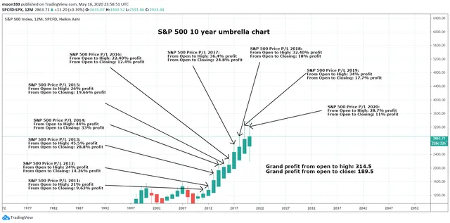
Now let's move to the S&P 500 10 years umbrella chart. And you will find a very big difference between the profit ratio that has been generated by the S&P 500 and the Bitcoin. As the grand total from opening price to highest price of 10 years is 314.5%. And the grand total from opening price to closing price of these 10 years is 189.5%.That proves that there is no comparison between the performance of Bitcoin and the S&P 500. Even though the S&P 500 is the index that is the most out performing among all other indexes and markets.

Conclusion:
As the most outperforming asset the Bitcoin has proven itself not even the king of all cryptocurrencies but also the master of all assets.
Note: This idea is education purpose only and not intended to be investment advice, please seek a duly licensed professional and do you own research before any investment.
///////////////////////////////////////////////////////////////////////////////////////////
My personal blog is:
https://moontripplethree.blogspot.com/
Earn Money for posting articles and content:
PublishOx:
https://www.publish0x.com/@moon333
LBRY:
https://lbry.tv/$/invite/@moon333:b
Uptrennd:
https://www.uptrennd.com/signup/NTI3Nzg
Patreon:
https://patreon.com/invite/xkmjnn read.cash: https://read.cash/r/moon333
Read.cash:
Steemit:
HIVE:
///////////////////////////////////////////////////////////////////////////
My social links to follow:
Tradingview link:
https://www.tradingview.com/gopro/?share_your_love=moon333
Facebook:
https://m.facebook.com/Moontriple3
Twitter:
https://twitter.com/moon33367268705
Youtube channe:
https://www.youtube.com/moon333
Telegram: https://t.me/moontripple3
///////////////////////////////////////////////////////////////////////////
Links for best crypto trading exchanges:
Binance:
https://www.binance.com/?ref=11256882
p2pb2b:
https://p2pb2b.io/referral/376549a8-b6e9-4ae7-82c8-34cdba324ebc