It was an itch, an annoyance, I wanted it back but this time I wanted full control and not to be reliant on @dizzydiscovery regarding, 'how to do this and how to change that'.
It had caused some friction between us in the past, as he was trying to run his business, and 'Tales of the Urban Explorer' was done on the cheap.
Don’t mix business and pleasure they say, and it’s fucking true, DON’T.
THREE years ago I decided to take 'talesoftheurbanexplorer.com' down; nobody was looking anyway. Google Analytics showed me less than five hits a day in the death throes.
Why bother when all this data was on HIVE; why keep spend cold hard cash on maintaining this beast, paying for hosting, keeping retention of a .COM url, and SSL, and that's not speaking of all the work it was creating for me?
It made no sense to me and yet here I am longing for it back. This time it will be MINE, designed by me, written by me, hosted by me and all done the hard way so I learn all aspects of it.
I turned to @steddyman, who's a DevOps Full Stack Developer and fortunately one of my best friends for advice.
...'maybe one day, it creates very fast efficient websites, but I need to learn the basics first'...
Source
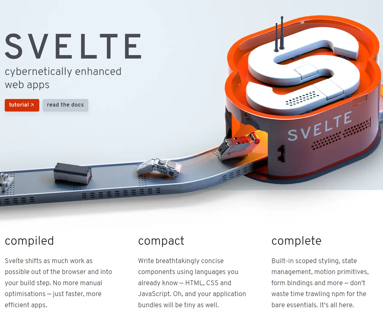
“Use Svelte”, he told me. It’s a framework and you can put together something in 30 minutes. So I did, and it was far from fucking simple. “Oh and use Skeleton, and don’t forget Tailwind CSS”.
After taking days to re-create the index page, I was done with all these add-ons. Tailwind I could handle, but these other frameworks were too much for me to ingest, and learning the lot at once was overwhelming.
...'parts of my code included svelte code, but for the most part, it was regular html, all wrong and a load of shit. I wasn't ready for this'...
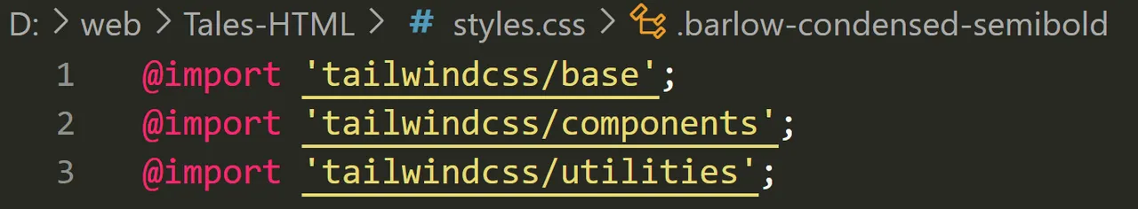
Stripping away anything 'Svelte', I quickly discovered I had been doing it all wrong, and 'page.svelte’ quickly turned into the more familiar ‘index.html’, but without the traditional ‘styles.css’, apart from custom fonts.
The Tailwind CSS classes contain a decent amount of fonts, but I was after recreating the one used on the ‘old website’ and that was not part of the included set.
"Don't use too many fonts", @steddyman advised me, but how could I make it look the same without using 'that font'?
Chat.GPT helped a lot when creating the old pages, but font recognition is not one of its strong aspects. You can send an image up and ask for it to 'detect' the font, but frankly, it's fucking useless at this.
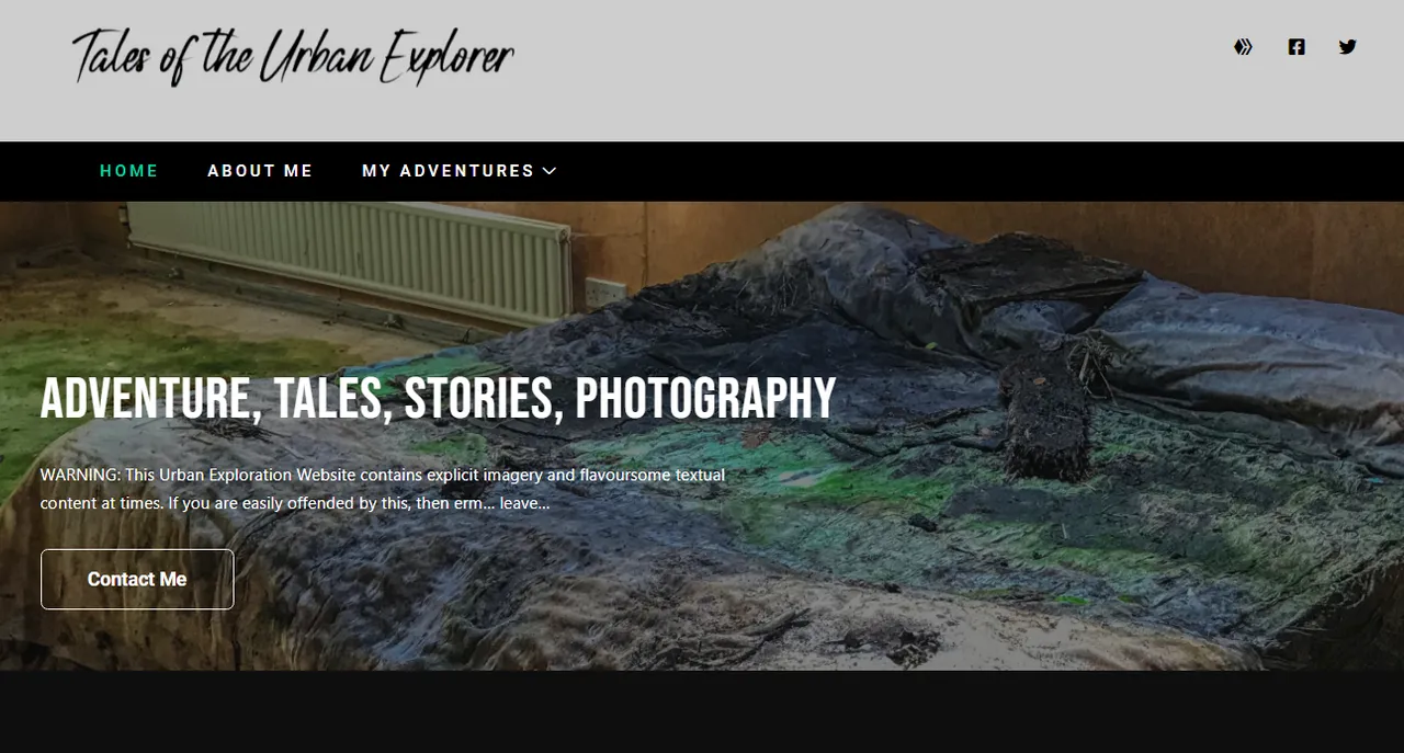
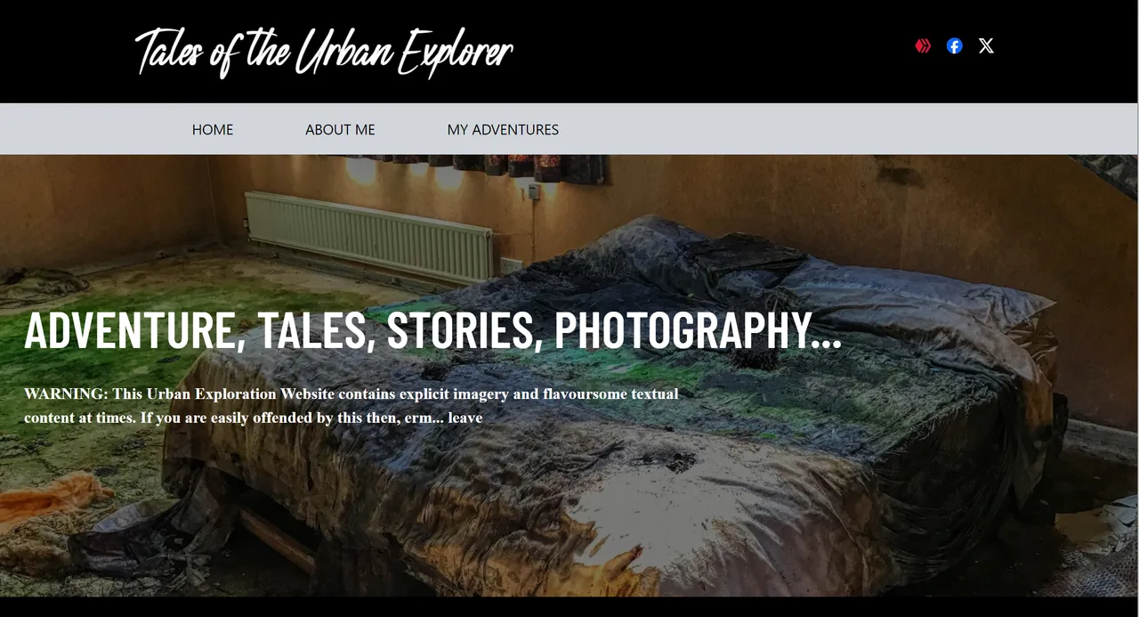
...'the original website, but what was that tall skinny font that made up 'ADVENTURE, TALES, STORIES, PHOTOGRAPHY'?, it took some finding'...
Knowing @dizzydiscovery once used https://rockerfeller.co.uk/ as his advertising platform, I was relieved to see it still exists and I knew he used WordPress as the foundation of his sites.
I needed to find 'that font' used for 'ADVENTURE, TALES, STORIES, PHOTOGRAPHY', and knowing @dizzydiscovery probably used it for another website, the place to look was his other work here.
Today I am trying to find that website amongst the ones remaining that still work in @dizzydiscovery’s show-off portfolio, and I’ll be damned if I can find the one. Maybe it went down like several of them on this page.
...'just like me, three years ago, all these customers must have realized that nobody looks at your brand-new website'...
No matter, as I can explain how I found it by an inspection of the source.
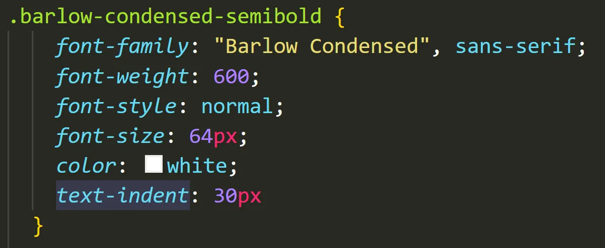
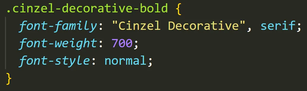
After some searching I found 'Barlow' was the one, so added it to my sparse ‘styles.css’ file.
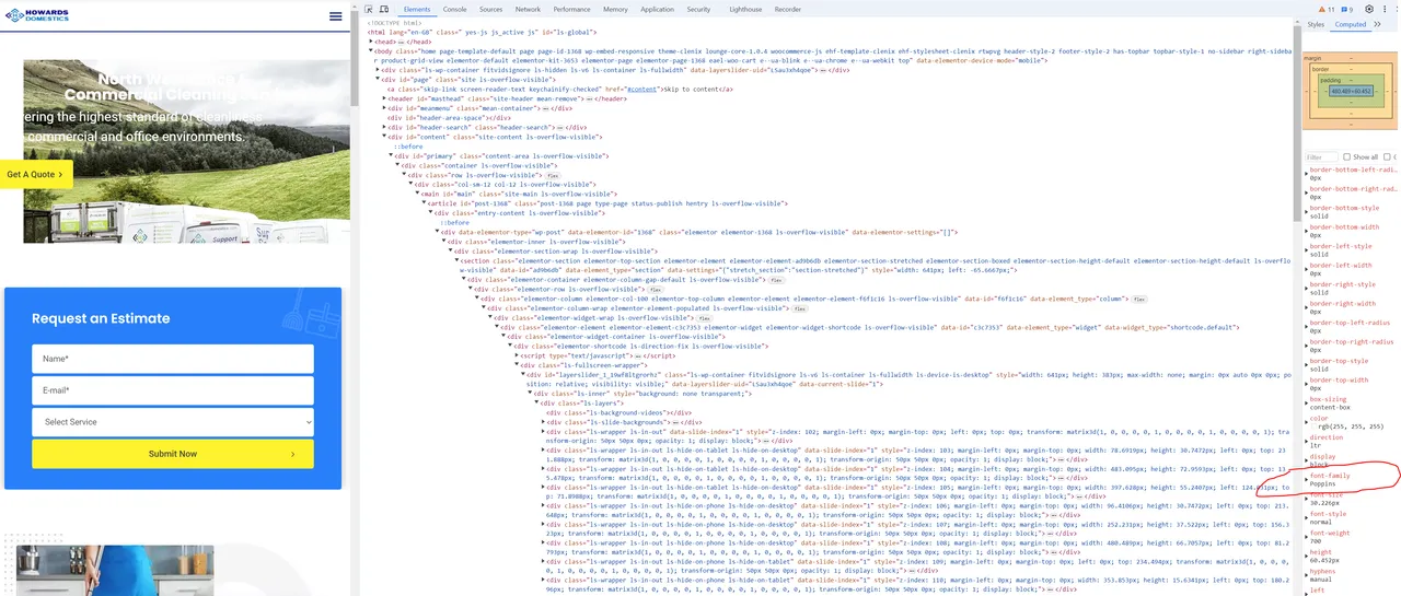
...'this one uses 'Poppins'. You can download most of them from GoogleFonts. It even creates the code for you to add, very handy'...
After spending 20 minutes searching @dizzydiscovery’s website and not being able to find the site I spotted ‘my font’ is quite frustrating. Using Right Click, ‘Block Element’ and then ‘Inspect’ reveals a lot of data, and fonts can easily be found.
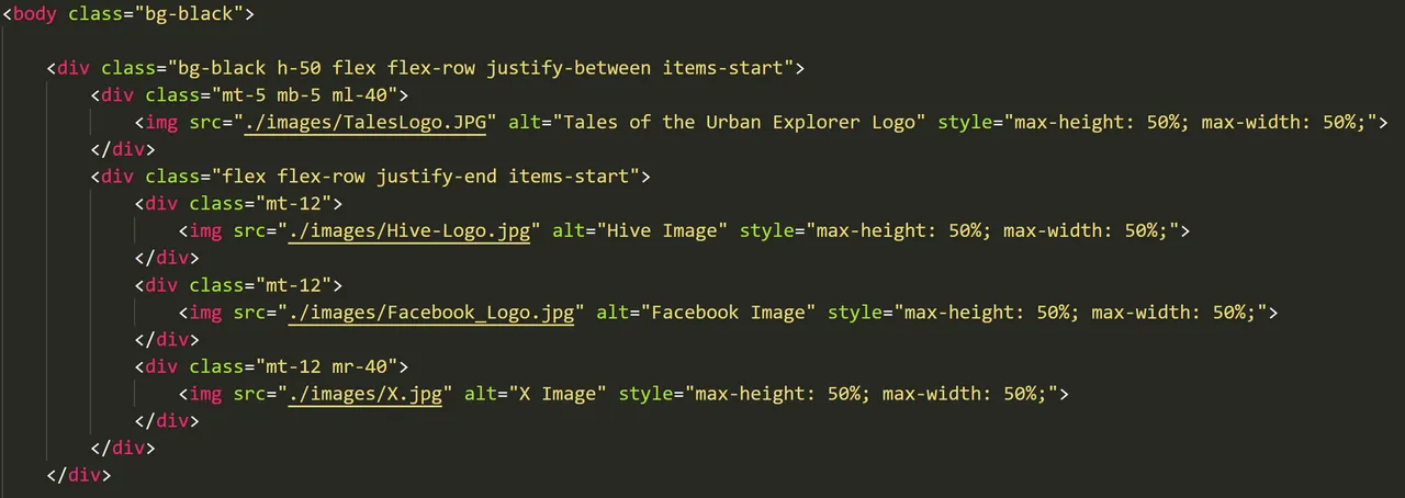
So now my ‘ADVENTURE, TALES, STORIES, PHOTOGRAPHY' was looking like the old website, but I never did like that top area in grey. Why not black, as black is always cooler?
...'this is not optimum I know. It can probably be done a lot more effectively'...
Twitter is gone, and now it's 'X', so that had to be replaced. Designing the top container took me some time as it was the first element I had done by hand, though the code is quite simple.
Chat.GPT was useful, but I had to keep reminding it to use Tailwind and not regular CSS, and even then it doesn't give you what you are looking for. At the end of the day, a lot of manual tweaking was required to place everything in position and now there's no 'Elementor' to help me do anything.
…’if you want to learn this shit, do it the hard way and don’t use overlay aids’…
Elementor is used on all @dizzydiscovery’s websites, and is another web-builder. While they are convenient, you are not going to learn the nitty-gritty necessities by using these.
After the pain of re-creating the index.html, it didn't get any easier with 'about.html'. I wanted to place images in different areas within containers and this took some fucking around with.
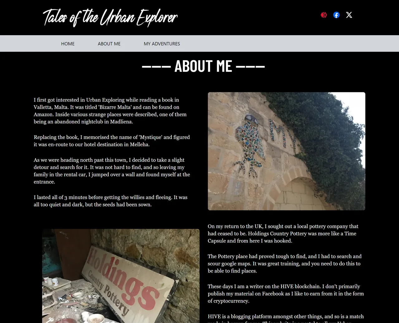
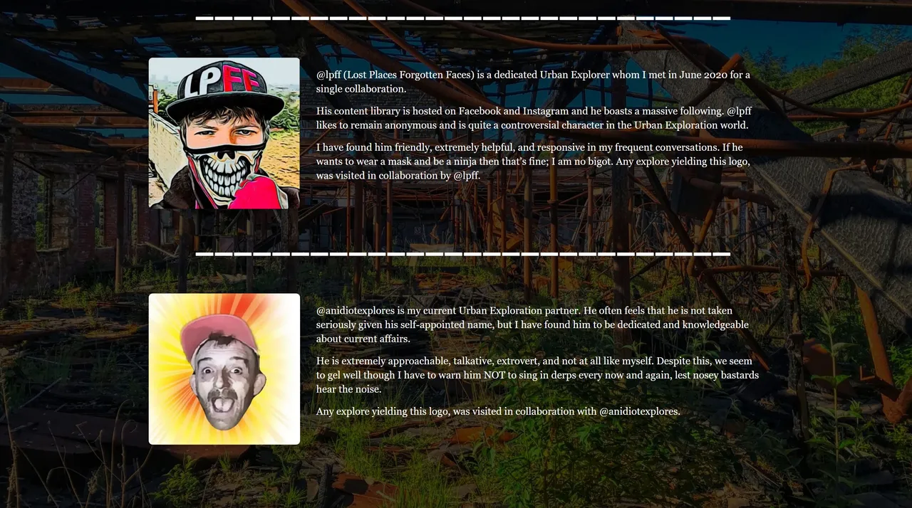
I think the result is worth it, and the collaboration part is similar to the original work done by @dizzydiscovery.
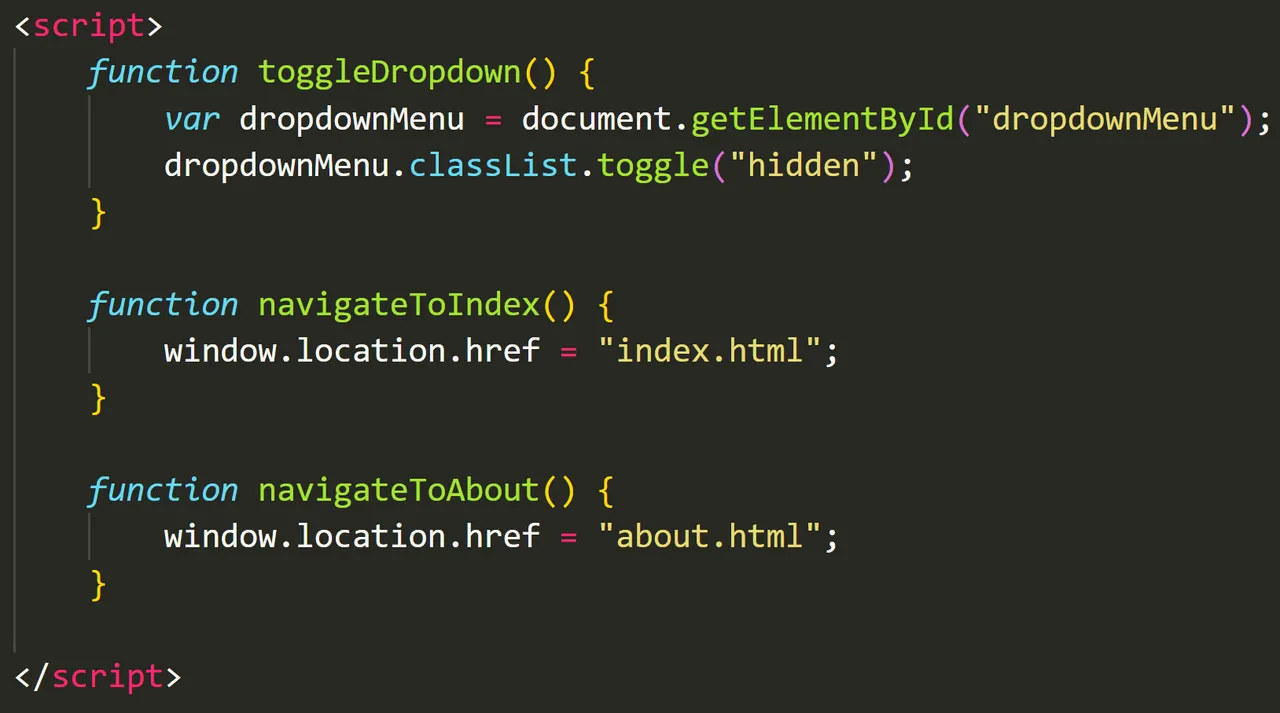
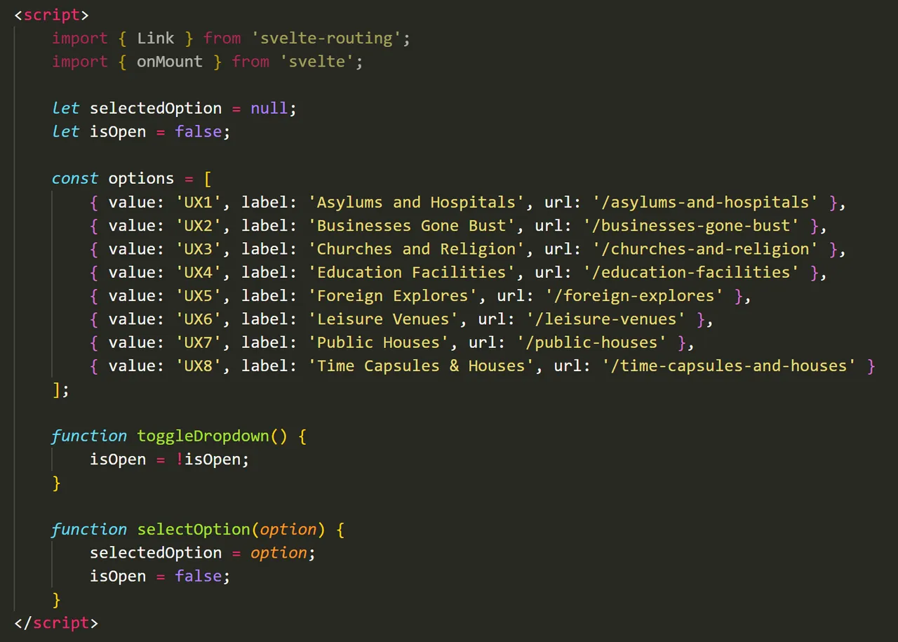
After this, it started to flow a little more. Each corresponding page would be topical and driven by a click event powered by a little JavaScript. This kind of shit I am familiar with and adding code is a simple matter of repetition.
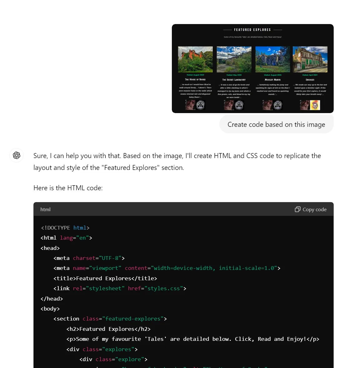
The next task I was faced with was the four explores in a line. This time ChatGPT came through nicely when I uploaded this image and told it to 'create the code'. It did, and as usual, it looked nothing like what I wanted!
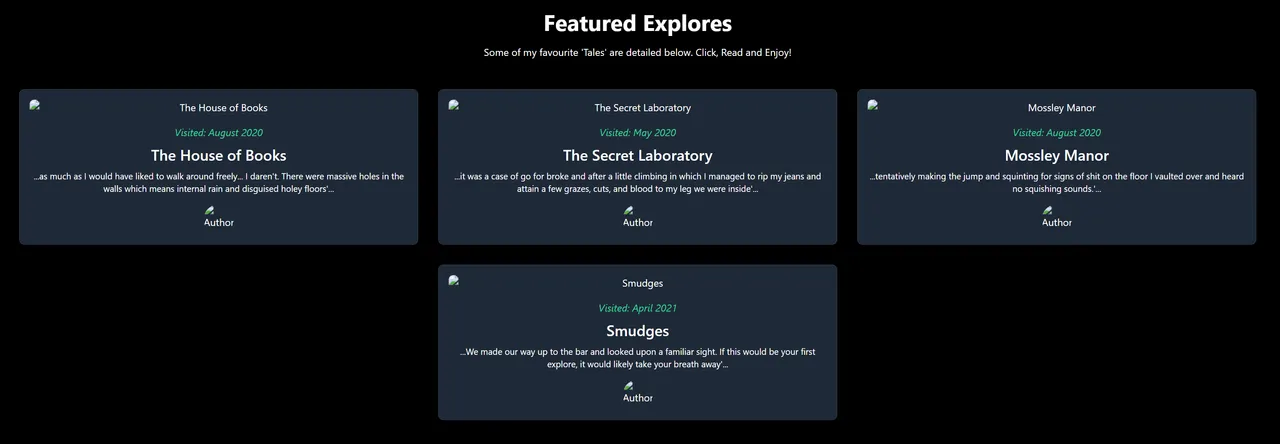
...'Erm... not quite what I was looking for, but it gave me a foundation'...
Using what I had picked up, I fucked around with the base code and managed to make it look like this. It was a start and all I had to do now was add another click event to the small images.
Each of them, I resized to 400x300px to save space. With 400+ explores the eventual target, space is an issue with paying for hosting. The old site resized the images.
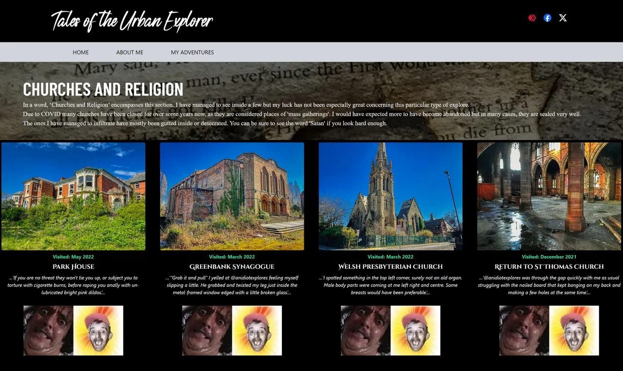
Now that's more like it, though again I am struggling to find the specific font @dizzydiscovery used for the titles, such as 'Park House'.
For now I am compromising on 'Cinzel', though it's not got quite the same appeal as the original one had.
I don't know how long it will be before 'talesoftheurbanexplorer.com' goes live again, but I am working on it, and more importantly, enjoying the experience, that is when I can drag myself off playing PS5 games.