English Version
Hello Hive aliens! As I told you in another post, I've been practicing the basic concepts of PixelArt while I'm reading the PixelLogic book. Specifically I'm in the chapter dedicated to colour; however, in the previous publication, a user called @dwarven advised me to watch the tutorials of Lospec and the truth is that it has helped me a lot, although the practices I've done are still in process hahahaha.
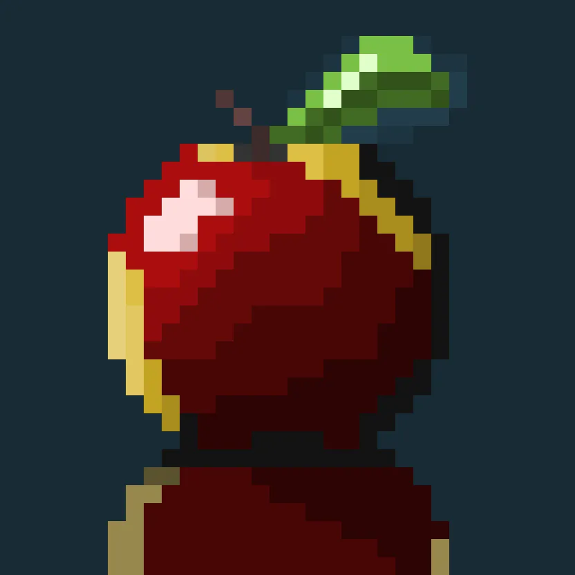
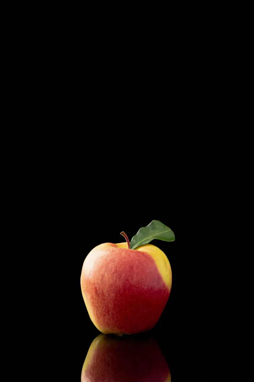
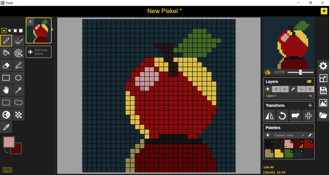
In this practice, I decided to simply use the picture of an apple as a guide; to focus on two concepts that are basic to PixelArt, which is the application of Anti-Aliasing which, as I understand it, is something like blurring the contours so that the lines can look smoother despite using a limited amount of pixels in the frame. The second concept I learned from Lospec's tutorials and it's the shadows; I think I still can't get the reflection and shadows quite right but I'm doing my best 🙃🤣 (little by little I'll improve, I know)
Here I'll tell you what I've been doing:
Step 1
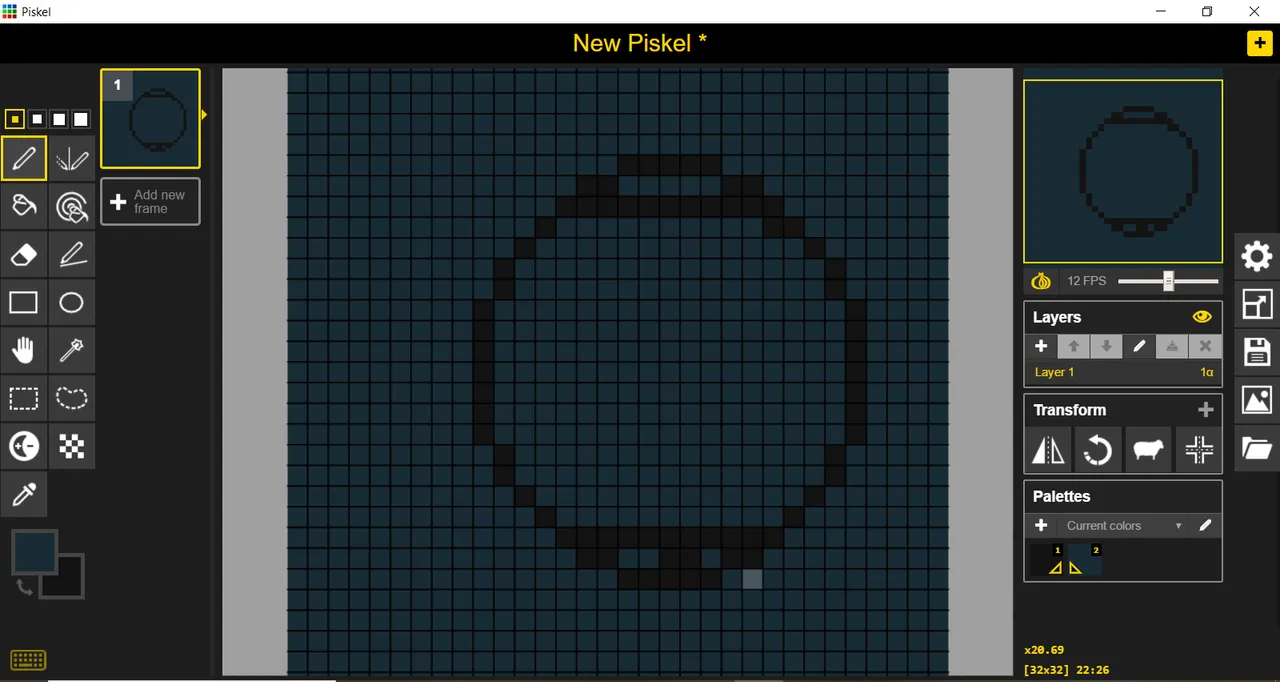
In this step, I added the background, for which instead of using absolute black or something similar, I used a greenish blue, to give it this typical pixelart tone; I used the circle tool to make the circumference and then I flattened the top and the bottom part. I first tried to make the shape following the advice on how to make the curved lines but the shape came out a bit strange, so I solved it this way.
Step 2
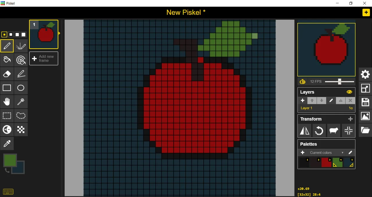
Here I added the background colour, the leaf and the little stem that was visible in the image, then I started to make the reflection below, the glow of what later would be the lighting, I removed the black border of the circumference and made the background yellow, without any shadows.
Step 3
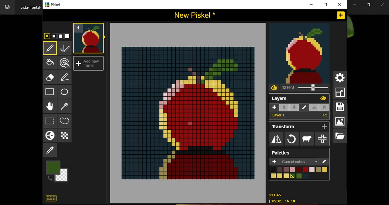
This step, actually, was not at all in the final result, but it helped me to learn a little more about the use of lights and shadows, in the original photo you can see the lighting in that point approximately, or better said, the spotlight, and as I don't know much about drawing in general, I asked my mum, who has always done oil paintings and drawings for advice, (by the way, she is also here on Hive and her user is @yannira ), she advised me to change the colour of the light and that it would cover a bigger portion, when I tried it I didn't like the result so I made a fusion between the light bulb I had before and the one in this step and of course I followed her advice about the colour of the light, because it didn't look so good to use a pink for that.
Step 4
For the final step I did spend some time on the shadows, trying to use the Anti-Aliasing technique (especially on the top sheet) and, it was at that point that I noticed that the whole apple was kind of on one side and not in the centre of the canvas, so I used a super hand tool to move it and correct my little mistake hahahaha.
I also had to change a bit the shapes of the apple, the colours of the stem, the lighting of the leaf, give shadows to the shadow (I don't know if that's right but I like the way it looks) and add a dark border on the opposite side to the light.
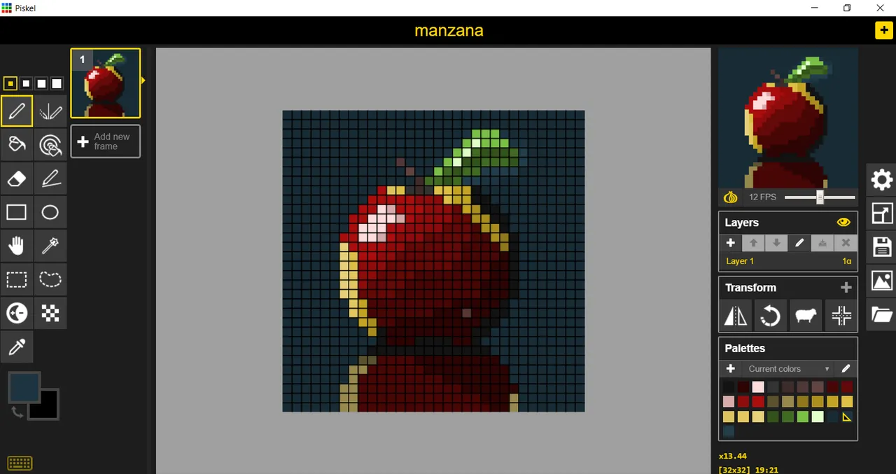
Although it is a simple drawing, at least I liked the result, I hope that those who see it can leave me their artistic tips and tricks to continue improving in the art of illustration, also, in advance, thank you very much!
For the illustration I used Piskel
Translated to English by DeepL
(Version en español)
Hola aliens de Hive! como les contaba en otra publicación he seguido practicando los conceptos básicos de PixelArt mientras voy leyendo el libro de PixelLogic. Concretamente voy por el capitulo dedicado al color; sin embargo, en la publicación anterior, un usuario, llamado @dwarven me aconsejó ver los tutoriales de Lospec y la verdad es que me ha servido muchisimo, aunque las prácticas que he realizado aun están en proceso jajajaja.
En esta práctica, decidí utilizar sencillamente la foto de una manzana como guía; para enfocarme en dos conceptos que son básicos en el PixelArt, que es la aplicación de Anti-Aliasing que, segun entiendo, es algo como difuminar los contornos para que puedan verse más suaves las lineas a pesar de utilizar una cantidad limitada de pixeles en el cuadro. El segundo concepto lo aprendí de los tutoriales de Lospec y es las sombras; creo que aun el reflejo y las sombras no me salen del todo bien pero se hace lo que se puede 🙃🤣 (poco a poco iré mejorando, yo lo sé)
Aquí voy contando lo que fui haciendo:
Paso 1
En este paso, agregué el fondo, para el cual en vez de usar negro absoluto o alguno similar, utilice un azul verdoso, para darle este tono típico de pixelart; usé la herramienta de circulo para hacer la circunferencia y luego achaté la parte superior e inferior. Intenté primero hacer la forma siguiendo los consejos sobre como hacer las lineas curvas pero la forma salía un poco extraña, así que lo solucioné de esta forma.
Paso 2
Aquí agregué el color del fondo, la hoja y el pequeño tallo que se veia en la imagen, luego empecé a hacer la reflexión de abajo, el brilo de lo que posteriormente sería la iluminación, quité el borde negro de la circunferencia y hice el fondo amarillo, sin nada de sombras.
Paso 3
Este paso, en realidad, no quedo para nada en el resultado final, pero me sirvió para aprender un poco más sobre la utilización de las luces y las sombras, en la foto original se ve la iluminación en ese punto aproximadamente, o mejor dicho, el foco de luz y como, no se mucho sobre dibujo en general, le pedí ayuda a mi mama, que siempre ha hecho pinturas al óleo y dibujos para que me aconsejara, (por cierto, ella también está aqui en Hive y su usuario es @yannira ), ella me aconsejo cambiar el color de la luz y que cubriera una porción más grande, al probar no me gustó el resultado así que hice una fusión entre el foco de luz que tenía antes y el de este paso y por supuesto seguí su consejo sobre el color de la luz, porque no se veia tan bien utilizar un rosado para eso.
Paso 4
Ya para el paso final si le dediqué un poco a las sombras, tratando de utilizar la técnica del Anti-Aliasing (En especial en la hoja de arriba) y, fue en ese punto que me percaté de que toda la manzana estaba como de un lado y no en el centro del lienzo, asi que usé una super herramienta de mano para moverla y corregir mi pequeño error jajajaja.
También tuve que cambiar un poco las formas de la manzana, los colores del tallo, la iluminación de la hoja, darle sombras a la sombra (No se si eso está bien pero me gusta como se ve) y agregarle un borde oscuro del lado contrario a la luz.
Aunque es un dibujo sencillo, al menos a mi me gustó bastante el resultado, espero que quienes lo vean puedan dejarme sus trucos y consejos artísticos para seguir mejorando en el arte de la ilustración, igualmente, de antemano, muchas gracias!
Para la ilustración utilicé Piskel
Traducido al ingles por DeepL