What's up My fellow hivelings!
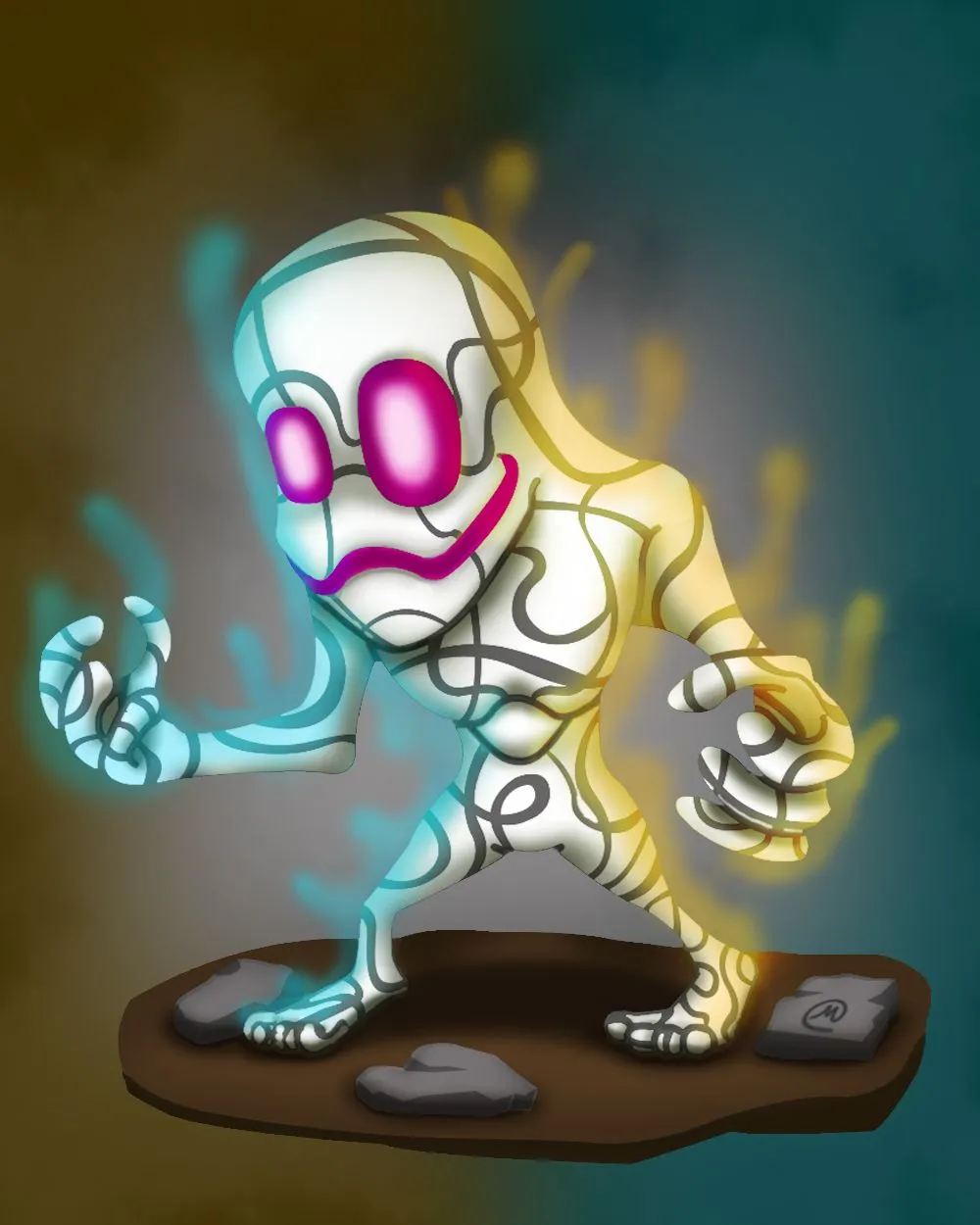
Its your boy mustachio again, And today I am posting a fan art that I have worked on since the last weekend.
So without further ado, here is my art process.

Reference
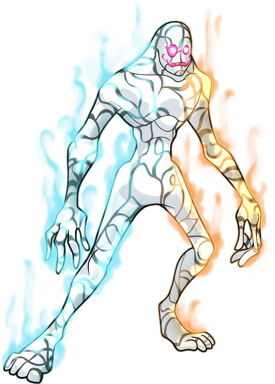
I used Almo Cambio as my reference for this fan art. You may ask why? it is because
for the past days, while playing splinterlands, I noticed that I am getting a lot of Noxius fumes (Posion) rule on my previous games and this guy right here is my primary pick for this kind of instances, So to thank this dude, I decided to create a fan art for him.

Drawing
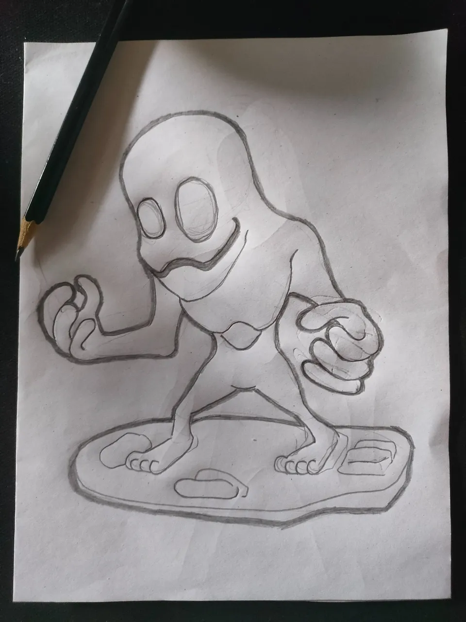
Of course every art I did like the ones before starts with a drawing sketch. I initially draw the sketch a very simple one since I'm just gonna be using this as basis only.

Outline
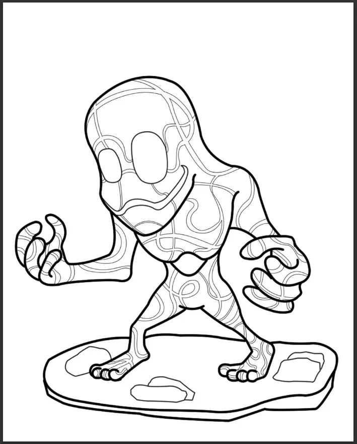
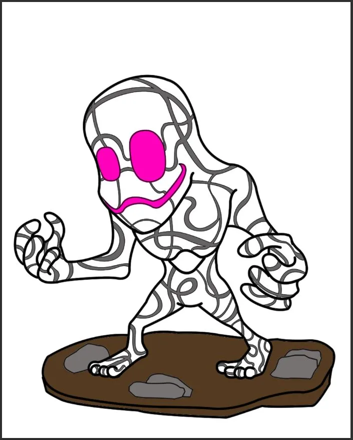
After the drawing was done. it is now time to outline the illustration using adobe photoshop. its gonna be our first step on digitalization. On these part you may noticed that I have added some strips on him which is not on the drawing sketch.

Base Color
Next step would be coloring the design by its basic color. of course the color was simply base on our reference character. Mainly white gray and pink, also brown for the soil footing

Shading
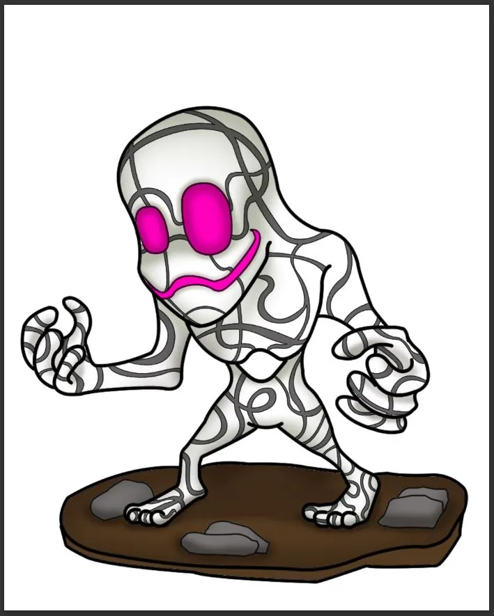
Now to make the image a less 2d and more appealing, the next step would be the shading part. shading which is based on character position and anatomy.
 |  |  |
|---|---|---|
| Shading 1 | Shading 2 | Shading 3 |

Highlights
After the shading of course there comes the highlight. but the thing is this guy is already white so how are we supposed to create highlight on this dude right? Luckily based on the reference image. Almo Cambio have 2 smoke-like aura on his side so we are gonna used those aura for the highlight.
I also decided to change the background from white to gray for now since we need to emphasize the highlight on this step.
 |  |  |
|---|---|---|
| Here I created a smoke-like aura with blue and orange color (Based on the reference image) with less opacity. | Using the aura I created before I now start to create highlights to our character. | Lastly I created a white highlight on Almo's eye this should give our character more life. |

Background
Were almost done with our character on this part, so we're just gonna need to do some background design.
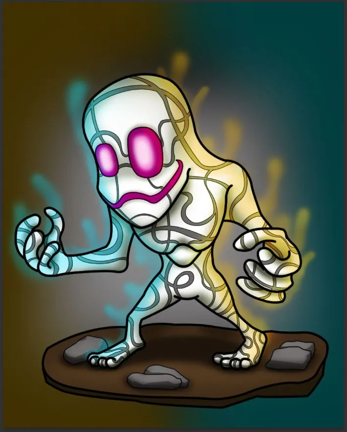
On this part I decided to color the background which opposites Almo Cambio's aura.
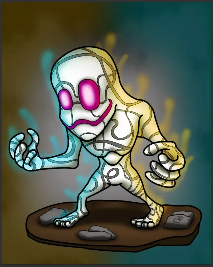
And to make it more appealing I added some smoke effect and also the signature.

Final Touches / Fixes
The overall illustration was actually done on this part, But I still decided to possibly remove the outline. for me the the outlines makes the artwork still a bit of 2d-ish so were gonna be removing them little by little.
 |  |  |
|---|---|---|
| First I change the color of the outline so it would compliment with the drawing but the result was lacking. | So I decided to gradually delete the outline from here making the image more and more 3d until I get the desired result I want. | After that I checked every nook and cranny of this design and fix all of the imperfection that I can see. |

Output
And this is my final output.

I hope you guys like my fan art. feel free to check my previous arts also and thank you for visiting my post.
Thanks my fellow hivelings and have a wonderful week ahead.
