Hello Everyone,
For this weeks entry I created a sticker art like design for the Disintegrator card.
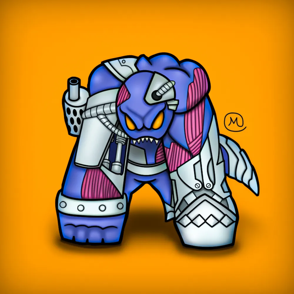
Here's the process.
OutLine
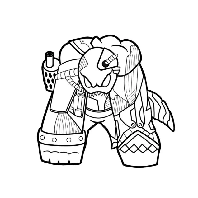
Base Color
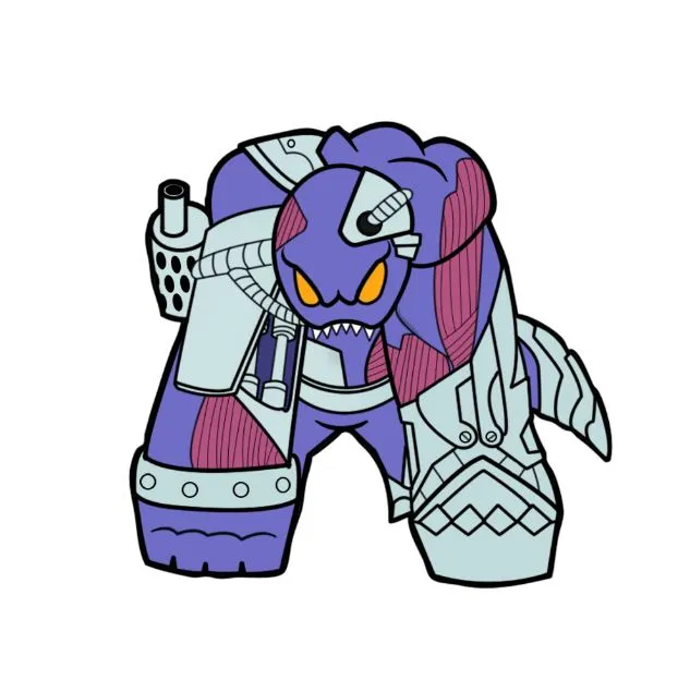
Shadow and Highlight for Contrast

Final touches includes:
- tweaking the overall color since I thought the piece was a bit too dark initially.
- changes in backround color
- adding shadow under it to make it more 3d like
- and adding signature.
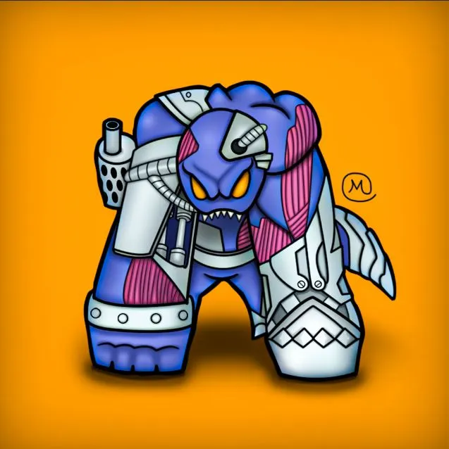
and thats all folks, hope you like it! thanks.