It was really quiet day I've been working on eSync as well as fixing some bugs and implementing new features for @eSteemapp.
We've been chatting in Telegram together with our illustrator and UI designer @dunsky where I've showed him few tweaks I've just made into current eSteem UI.
I am not sure guys, if it will be boring to read our chat here seeing how we were looking for some user interface solutions or not. If you really read the my posts, please let me know... :)
@good-karma: Working on the header avatar finding the way for filters to sit next to avatar or below. Some fiddling...
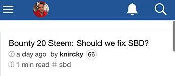
@dunsky: Cool! I think filters should go under the header. Like the mobile version of Steemit does.
@good-karma: Some tweaks...
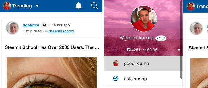
@dunsky: Looks really good! :) Have you tried making the bell and search icons smaller like the size of the pen icon there? God, this pink background overlay makes me crazy by the way!
@good-karma: Will fix that now too. There are lots of people complaining about that to me.
@dunsky: What if we will try
box-shadow':'inset 0 0 0 2000px rgba(33,34,35,0.7)? How do you think can we remove that avatar shadow in the post previews also?
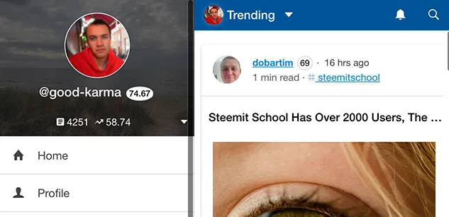
@dunsky: This one is better. I've seen it on desktop and those seemed too small looking but on mobile it's looking exact as it should be (at least for me).
@dunsky: Tested some headers, found that glow is not going to work. It gives me that feeling of old interfaces. I've also tried to tweak that brand blue color. If you like maybe we could test this?
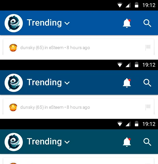
good-karma: It will require splash screen color change though. Do you think post title is well positioned by the way? Changes are: author, avatar, linked username and tags.
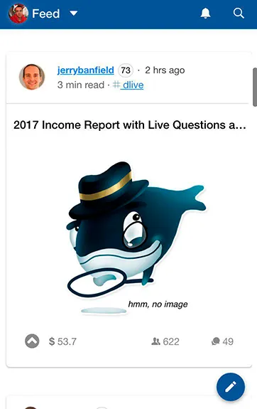
@dunsky: Splash screen updated and submitted to github. Please check some post view tweaks also:
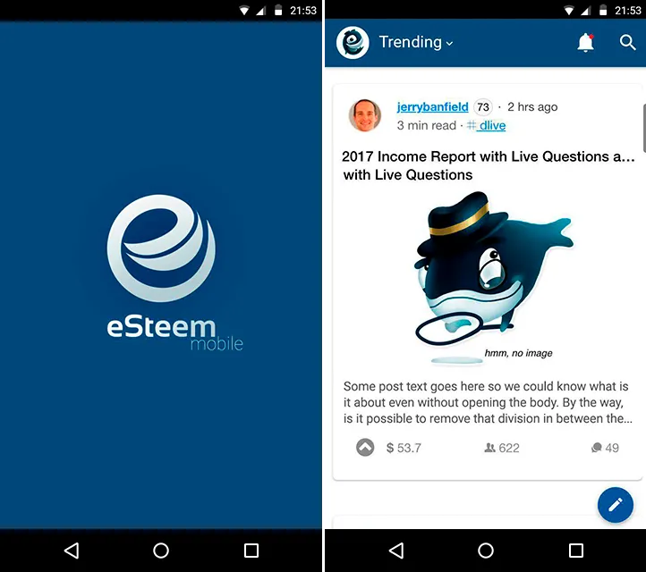
@dunsky: Whenever the title is too long see if we can have two lines of the post title? And may we add 2-3 lines of the post body text? If we will remove the dividing line in between post header with avatar, username, tag etc and in between the post preview maybe it would lighten the overall look.
For the top header I would suggest to made it slightly thickier (just a little bit) so we can have littble bit more room and our design elements would breath easily there.
@good-karma: About the text preview, don't you think it would overcrowd the design? I don't know, we could try... two line of title was also one of the things I've tried to avoid to make UI look less overcrowded. About line I agree, removing should lighten up. Title and preview is bit tricky to cover all edge cases... Something to think about bit more. But yeah, let's simplify then :)
@dunsky: 👍
What do you say, guys? Shall we continue such a story posts about eSteem development from time to time?
Steem on!
- Email:
info@esteem.ws - Home: https://esteem.ws
- Github: https://github.com/esteemapp
- Steem.chat: https://steemit.chat/channel/esteem
- Facebook: https://fb.com/esteemapp
- Telegram: https://t.me/esteemapp
- Discord: https://discord.gg/WywwJEu