Technical analysis tutorial for beginners! This introduction to technical analysis will show you how to apply TA charting methods to crypto.
Be sure to subscribe to our channel here: https://www.youtube.com/c/CryptoCoinConsultants
And feel free to also watch it on YouTube here:
Disclaimer: This is not financial advice. I absolve myself of all responsibility (directly or indirectly) for any damage, loss caused, alleged to be caused by, or in connection with the use of or reliance on any content, goods or services mentioned in this article. As usual, DYOR.
Script:
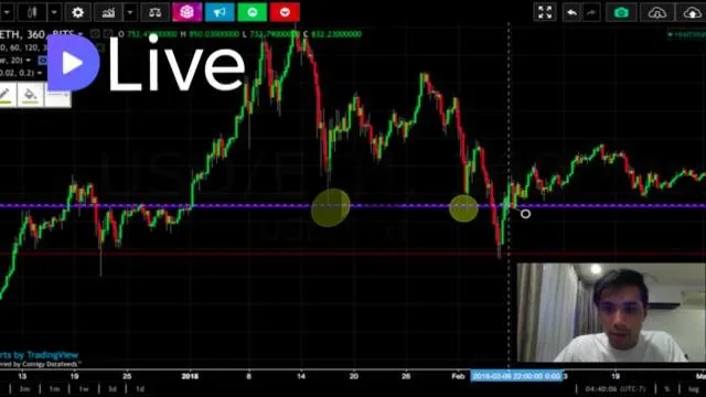
The first & most common thing you’ll see when opening up a graph are green & red bars, called Japanese candlesticks. These candlesticks indicate the direction the price moved within a given time period; so if we wanna look at the 1-day charts, each candlestick represents the price movement for one entire day. If we look at the body of a green candlestick (and ignore the lines extending above & below it), we’ll see that the bottom line indicates the price that that coin opened for that day, while the top line tells us the price the coin closed at that same day. The lines extending outwards are called “wicks,” and indicate both the lowest & highest prices the coin sold for within that 1-day period. The only difference between a green candlestick & a red candlestick is that a red candlestick indicates that the coin’s price closed below its opening price; meaning price moved downwards for that day. Now let’s put this into action. Looking at Bitcoin’s 1-day graph--which you can see I’ve selected here by clicking on 1 day--you’ll see the prices for the open, high, low, and close represented by O, H, L, and C, respectively. Hovering over to January 5th, 2018, we can see that Bitcoin opened at $15,143 dollars for the day, at some point dropped down to $14,810 and reached as high as $17,200 during that same day, and finally closed at $16,928. Three days later on January 8th, 2018, Bitcoin opened at $16,173, reached as high as $16,300, dropped all the way down to $13,900, and finally closed at just under $15,000. The next thing I’d like to discuss is what you’ll hear referred to as support & resistance. These are price levels in which the price of a coin is prevented from being pushed further upwards or downwards. Support--also referred to as a floor--is the point at which a coin has repeatedly dropped to a certain price point before being bought up again. Resistance--also known as a ceiling--is the opposite; the point at which a coin has repeatedly gone up & touched before being pushed down again. Keep in mind that support & resistance levels are merely “zones,” meaning they act as a general area in which price is predicted to bounce off, rather than an exact price. You can use support & resistance levels to your advantage by buying low when a price reaches an expected support level, then selling it off when it hits its resistance. One thing to note too is that when price breaks a certain support level, you’ll oftentimes see that same, former support level act as resistance later on down the road, and vice versa. Now let’s go back to the charts so you can see exactly what I’m talking about. Looking at Ether’s 6-hour chart from mid to late December of 2017, we’ll see that the price of Ether was repeatedly facing resistance around $750. With the exception of December 18th, 2017, every time it hit resistance, price went back down until finally on January 1st, 2018 it broke through. You can also see that that same $750-ceiling later on acted as an important level of support here, here, and here, in which price moved back up after touching it. The last concept I’d like to cover in this video is a tool called a trendline. As its name implies, trendlines show the general trend of a particular coin’s price. A coin’s price trend can move in one of three different directions: up, down, or sideways. You can think of trendlines as sort of dynamic areas of support & resistance, which will make more sense once we look at the charts. Again, these are general areas (or zones) of support & resistance, and are difficult to pin to an exact price. Some key things to note are that two touches to a trendline form a speculative (or tentative) trendline, while three touches to a trendline are a confirmed trendline. A touch is made distinct from another touch when they’re separated & spaced out from one another, rather than clustered together over the course of a smaller time frame. Thus, bigger time frames (like the 12-hour or 1-day, for example) lead to more valid trend lines. The more times price touches a trendline, the stronger or more powerful it’s considered to be. Longer trendlines are more powerful; meaning the longer the trendline has been intact, the more likely you are to see this line get respected, and for price to predictably bounce off it. But keep in mind that the more powerful the trendline is, the more violent you’ll see price react once it does manage to break that trend line. Going back to Bitcoin’s 1-day chart from May through December of 2017, for example, we can draw a confirmed ceiling trendline here. Note that price touched--and at times came close to touching--the trendline more than three times. Late October/early November saw price test it & break through, but it was suddenly pulled back down until it broke through again in mid-November & reacted violently with an almost 200% increase in price over the course of about a month.
My video is at DLive
