FONTS, FORMAT AND FUNK !
My major concern is that my books should be readable.
For my novel I have chosen to buy the 'dyslexie font' at £49. This is for a license to print a vast amount of books. Yes, another cost, but I want to get it right.
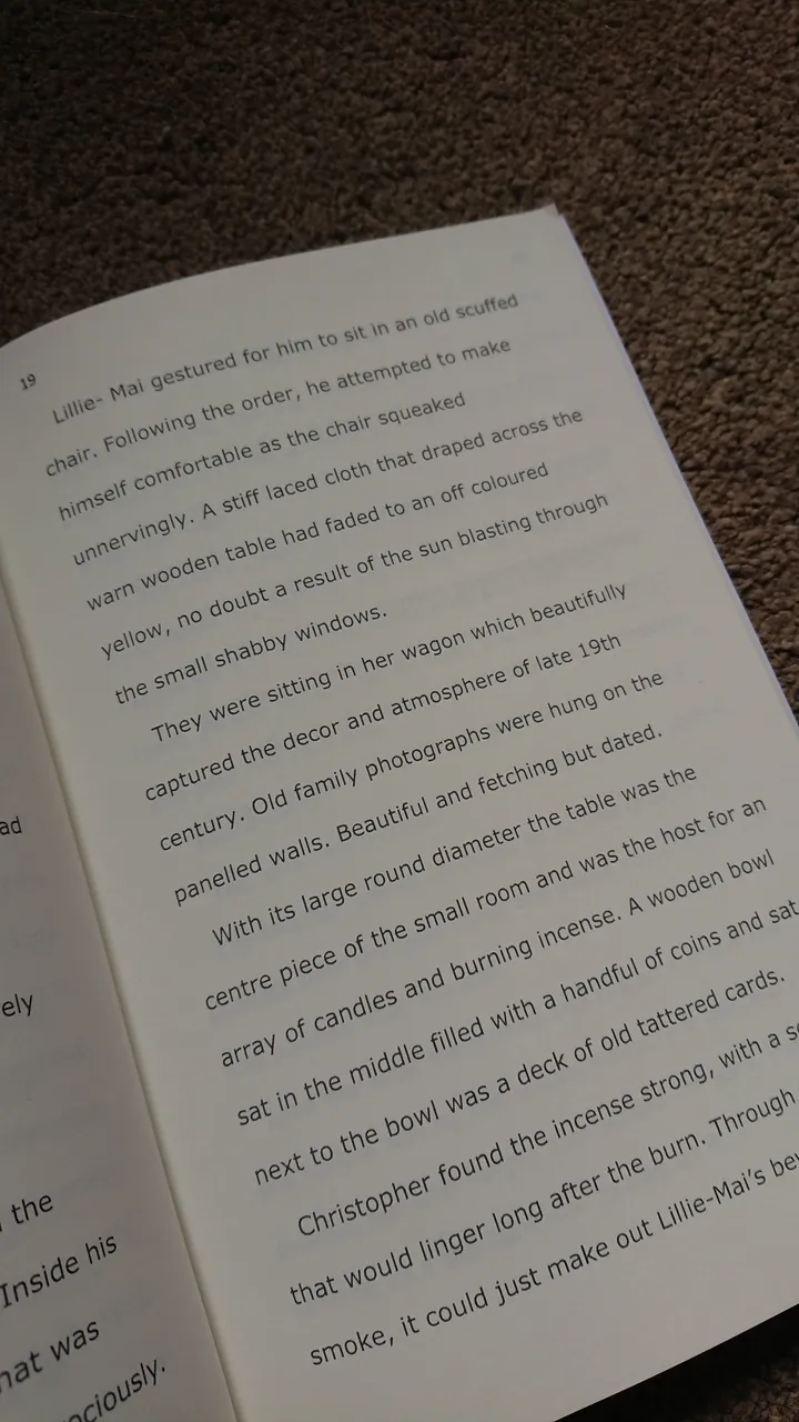
However on Amazon KDP, through create space, I have printed a short story on the Verdanda font point 12 and this has come out very nice. Of course it is on cream paper also. The book is a 6x 9 and that makes a difference with font size. It is also double spaced.
Black print on white paper is definately a NO!
Here's how it looks on paper. My mum can read it better, shes not dyslexic but is visually impaired.

Most books these days are readable, but I want to design something with particular emphasis on the dyslexic mind because I know first hand how difficult it is to read with that mindset.
I have some old books that are so small in text, that I have never read them and books that are on white paper with a sheen on them. I couldnt get past the first page.
I dodge sentances as a default, and although every dyslexic is different, it is important to get a good font.
As for formatting I do use indents and that does help with the readability.
For my short stories (I will be advertising them soon) I tried different book sizes to experiment. 5x8 and 6x9.
The 6x9 was a bit big I concluded for a short story (5,000 words) but the 5x8 was a perfect fit.
So for my novel I am choosing ...
Dyslxie font
12
1.5 spacing
Cream paper
6x9
Here are some examples of different sizes.

I have since changed my short story book covers and gave them a revamp. They are live on Amazon now, but I haven't promoted them yet- although I have had eight book sales which I didnt expect! Only one was from a friend, the person I swore to secrecy...
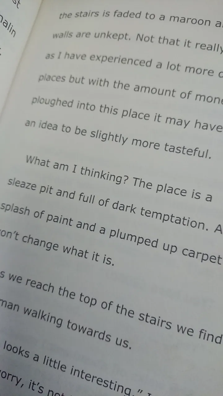
My novel will be the same size as the 'millionaire dollar blog'- good read actually and as you can see the book beneath it is my short story. A bit big, and thin. So my short stories will be in 5x8 like the size of an average novel (The girl on a train. ) At 64 pages it doesnt look clumsy, or thin and it accomadates a nice readability factor.
Here is the interior of the 5x 8 short story.

The novel will not be double-spaced as it will be compensated with a better font and design. However, I will only be sure of its effectiveness once I receive proof in two weeks time!