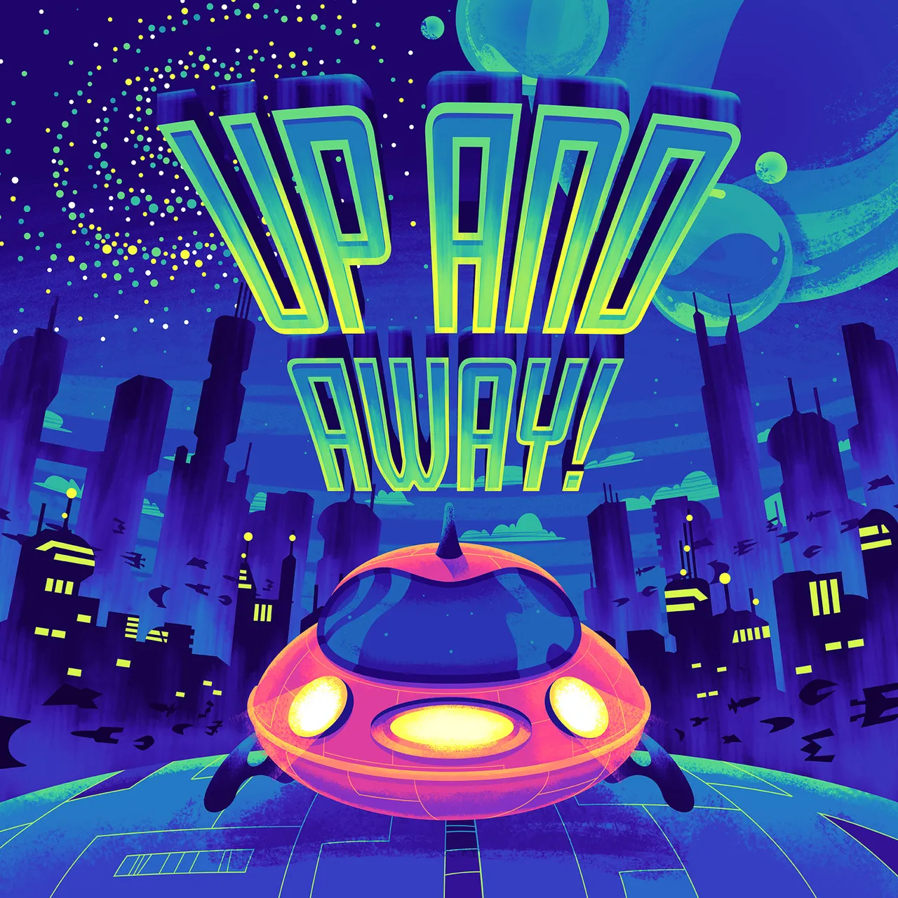
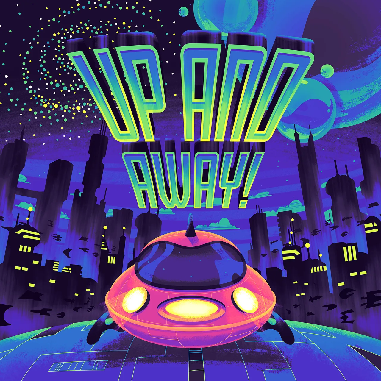
I was commisioned by Royal Carribbean to create this illustration for one of their onboard shows, "Up And Away". It's a blacklight puppet show, following the story of a young child and his friends visiting different worlds throughout the universe.
I used a combination of Illustrator and Photoshop to complete this piece. I typically use Illustrator to bang out the most of the sharp-edged shapes before adding any texture or lighting. I find it's much more fast for myself that way.
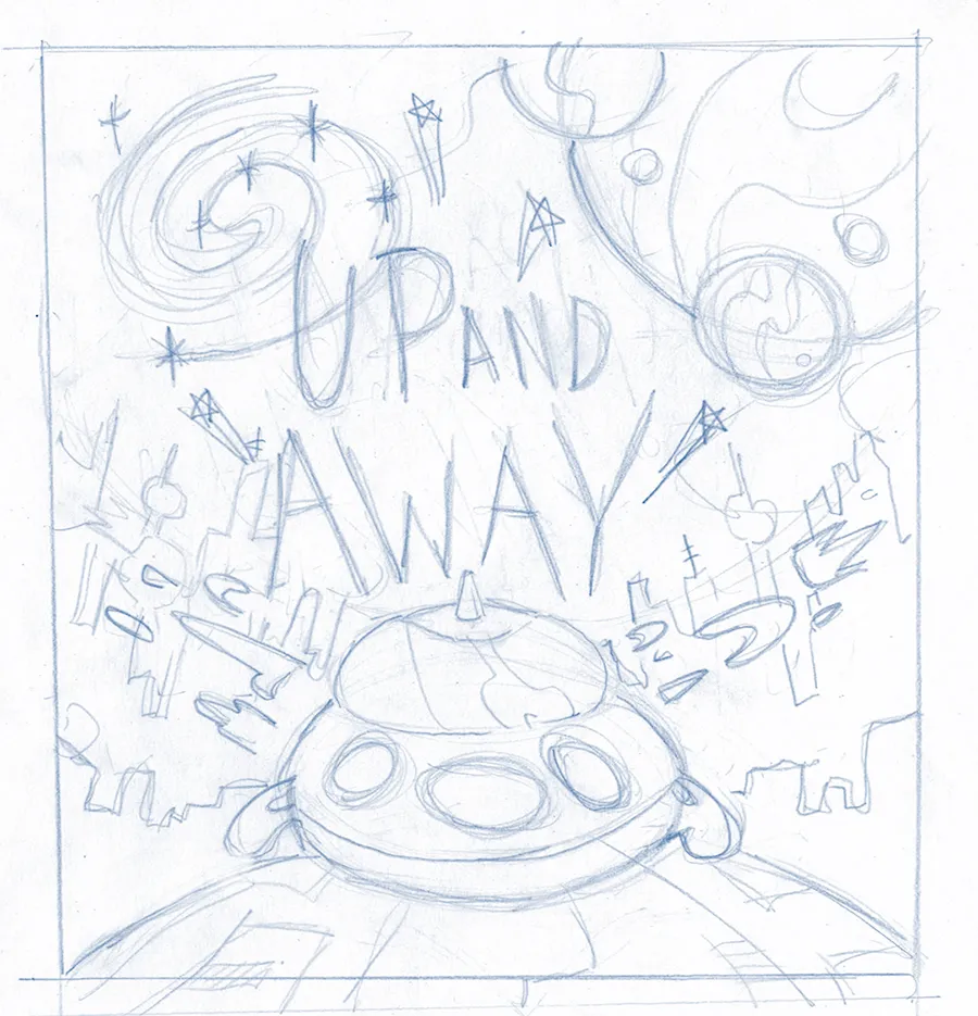
I almost always start with a rough pencil sketch before moving onto anything else. Once the general idea is locked in, I move onto a black and white, tonal illustration. This establishes the different values and contrast between the different elements.
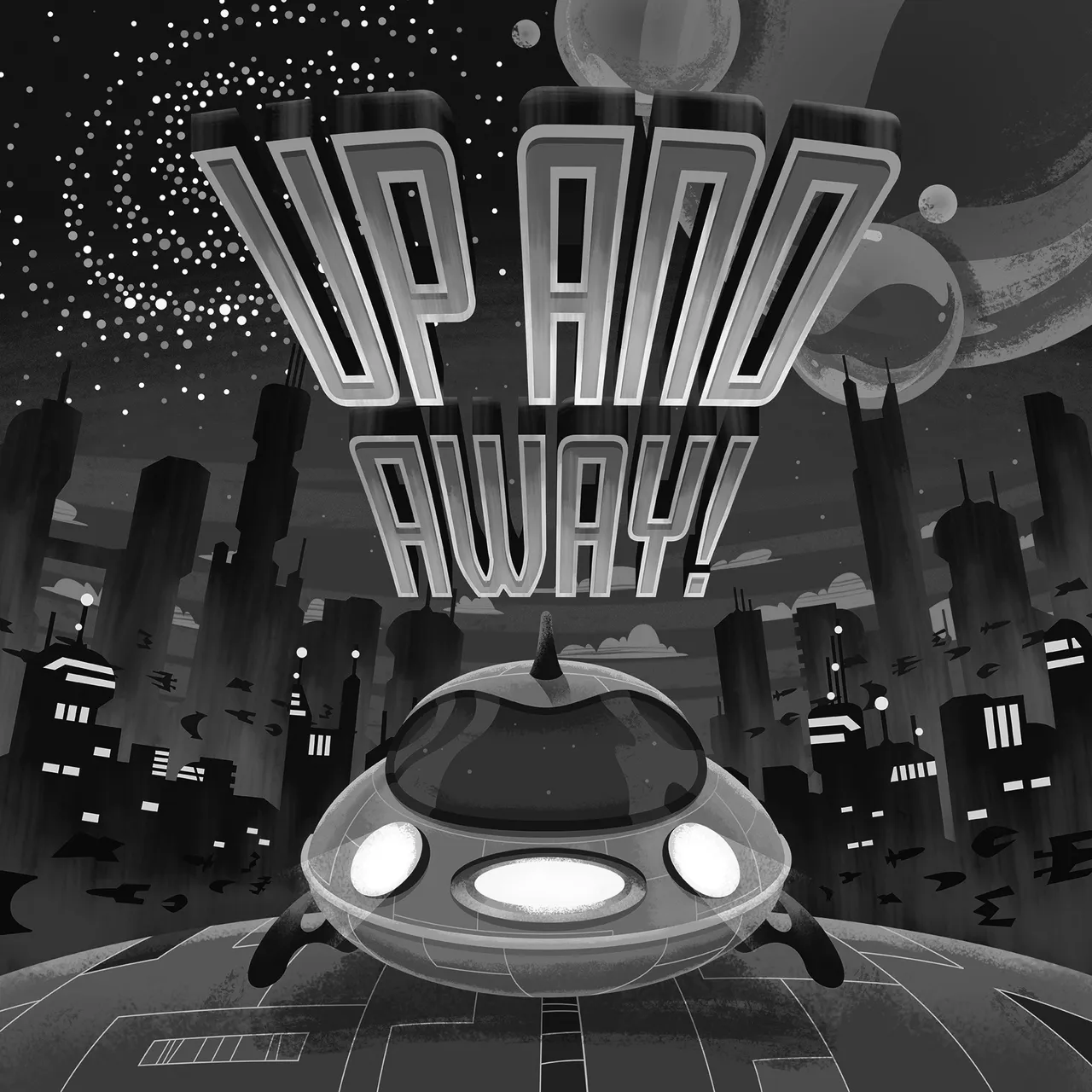
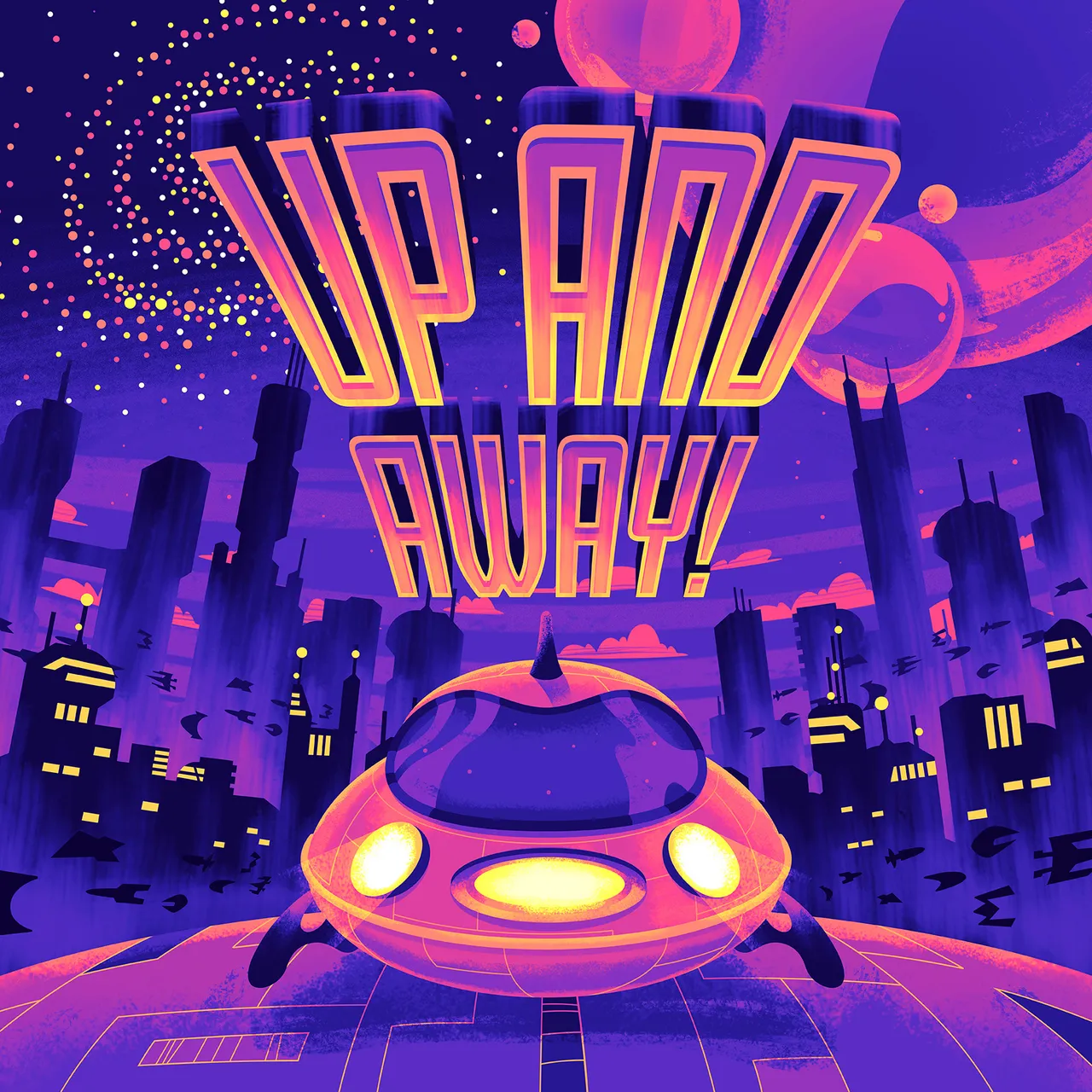
Below are some other color variations that I created. Because I got the tones out of the way, I was able to quickly create different color combinations with the gradient map tool inside Photoshop. Which one is your favorite?
