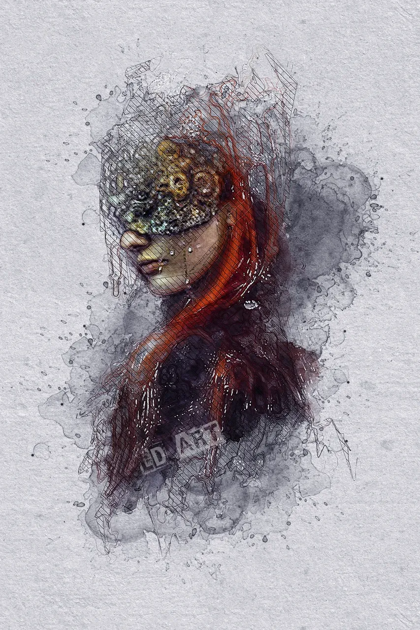
Ok my smashing pumpkins, something a little different from what i usually post. But it is a style i have done before. This piece i have called "Blinded". I thnik because the model is wearing a mask/blindfold. simple as that really. And i like the fact that it is really minimal too. If i had gone really messy looking with it, i dont think it would have looked the same. I do like trying out past styles i have used on new images i find. sometimes the style i currently am using - the messy lines look - just doesn't go with the image i choose. Variety is the spice of life,and all that.
So, i hope you like what i have done with this image.
To see some of the things i use in my art work, check out my deviant art page ----> https://www.deviantart.com/lucydyerart
And to see more of my art, check out my website ---> https://lucydyerart.com/
And if you fancy following me, i am on:
Minds ---> https://www.minds.com/lucydyer73
Pinterest ---> https://www.pinterest.co.uk/LucyDyerArt/
