Getting the Right Image
I'm always on the lookout for some good light. This season, with the long shadows at dawn and dusk, provides so many beautiful vignettes. A simple walk to the train can be interrupted by a flash of gold on the ground like so many nuggets glistening on the wet pavement. The rusty fire hydrant, happy to have company all around, pauses in its game of jump rope like a toddler waiting to cross the road.
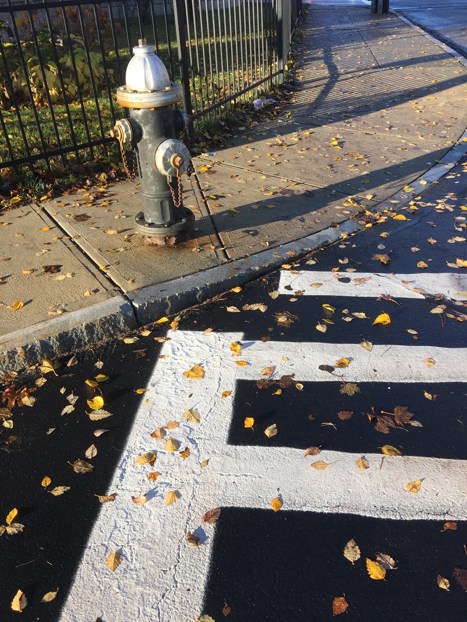
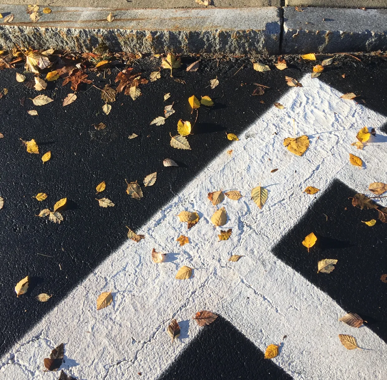
But the leaves, the leaves are what captured my attention, and the abstract lines of the crosswalk. This combination needed further exploration. But, a crosswalk. Not too exciting. Too recognizable and mundane, even with the leaves. How to focus on the leaves, but still use the graphic quality of the crosswalk? Abstraction.
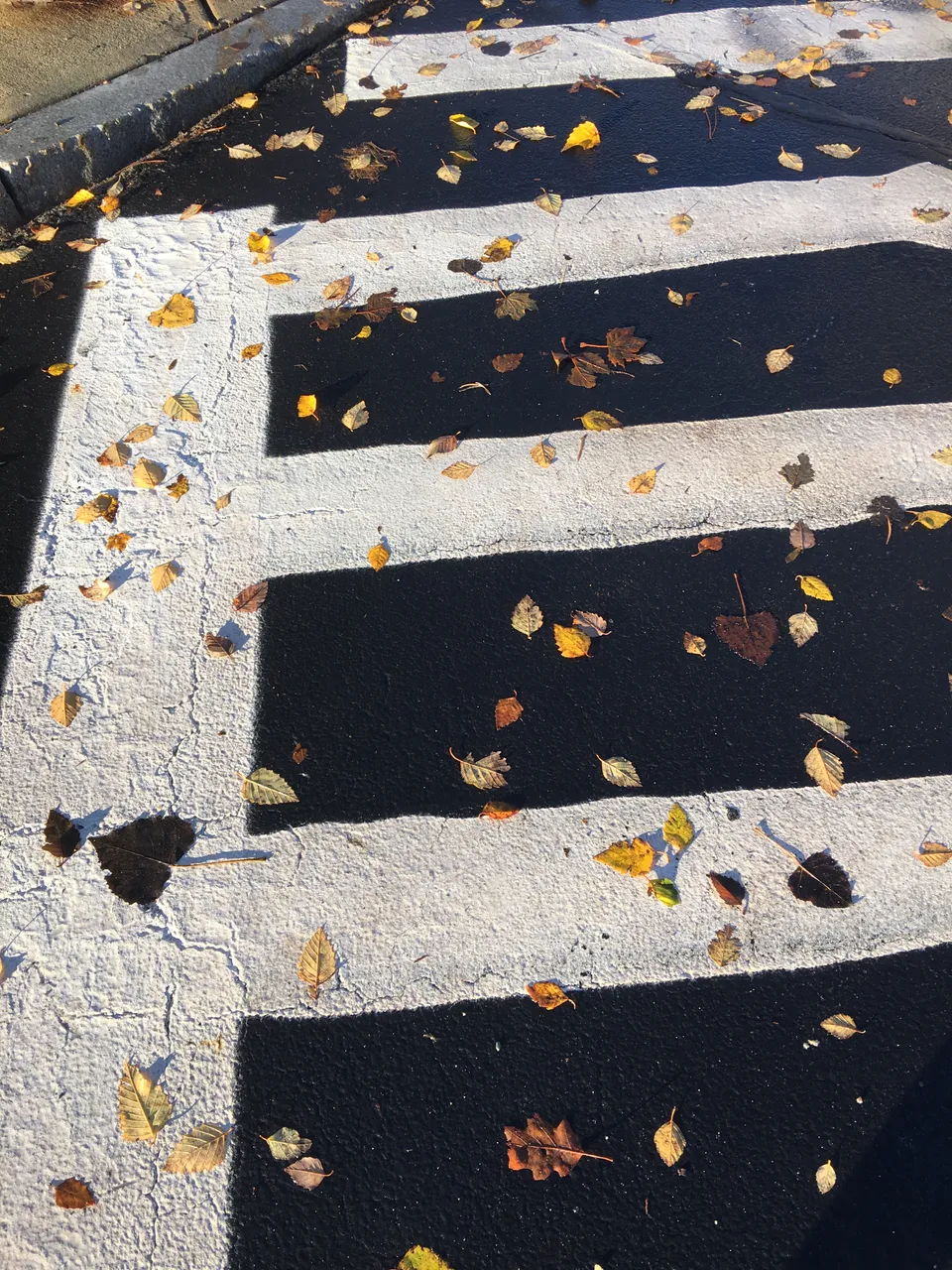
To retain the blunt white and black lines, but to help keep them somewhat vague, I tilted the camera to align it with the curb, instead of the crosswalk itself. The curve of the road allows the angle between the crosswalk and the sidewalk to not be a right angle, which I think adds a lot of interest to something that is otherwise quite boring. But, that wasn't quite enough.
Getting the Image Right
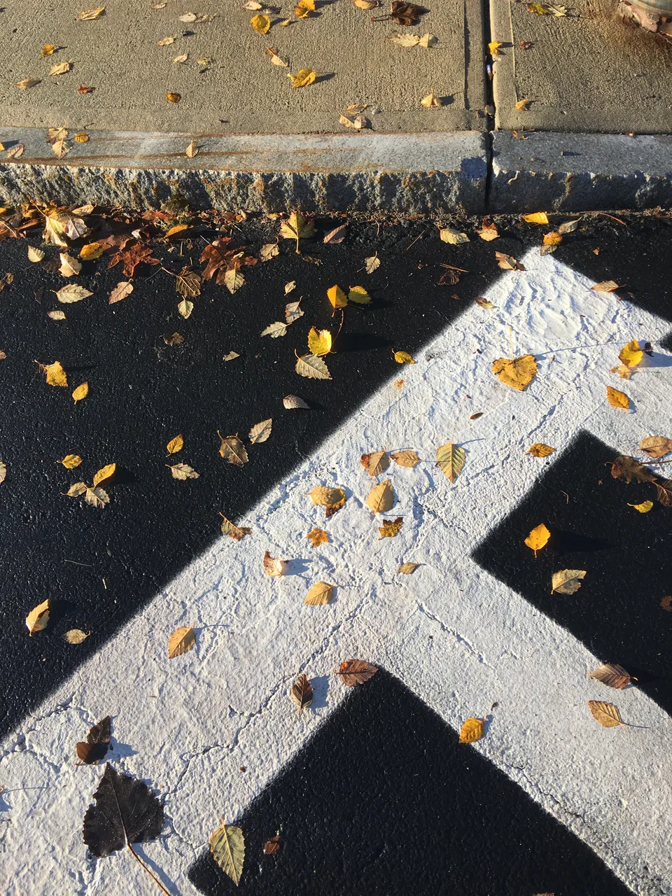
Enter Instagram. Sometimes I cheat, and use the filters from Instagram without actually posting to it. I just take a screenshot and cancel the post. You get to enjoy the original content, unadulterated by non blockchain sites. First, I tried the LoFi filter and adjusted the structure and contrast. When reviewing the original image, I thought it was too washed out. I like the bold contrast, but I also like the details in the paint.
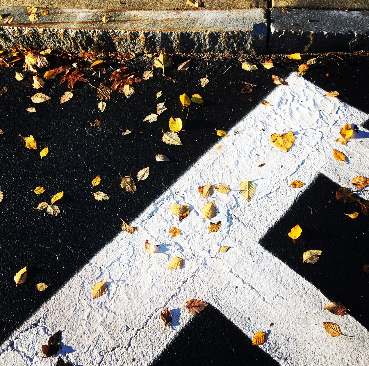
For this final image, I chose no filter, and adjusted the structure back to zero, and put the contrast almost back to the default setting. Then, I upped the brightness just a tad. It's not too different from the original. Sometimes less is more. Sometimes. I really like how it turned out. The square format really complements the lines, adding to the abstraction.
I hope you enjoy seeing the creative process I use to get to my final images. Let me know what you think in the comments, and don't forget to follow me for more!