Elizabeth is the princess from the Liones kingdom who, along with meliodas is in search of the “Seven Deadly Sins” (the good guys) to fight against the “Holy Knights” (the bad guys).
Drawing:

Now the process of creation :
The first thing I did was drawing a barbaric amount of sketches without meaning to look for a pose the represented the general personality of the character; that’s why I decided to stay with the sketch of “Elizabeth doing a


Next thing was to do the final lineart of the drawing to make the lines less sloppy.
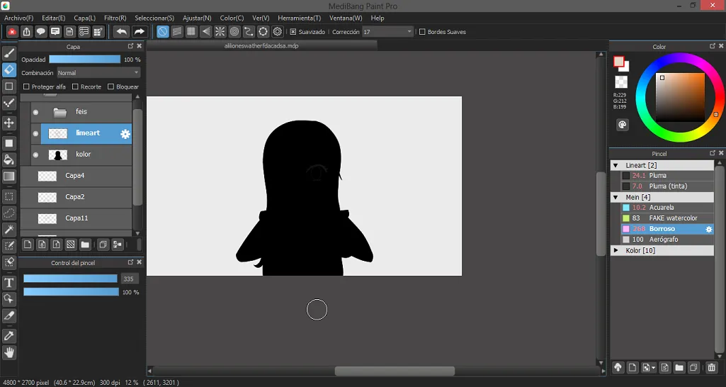
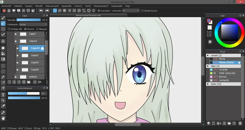
With the lineart done I proceeded to apply the flat colors; to avoid getting out of the borders and also not leave any pixels without coloring that is something that tends to happen when using the “paint bucket” tool, I personally use the following technique: I use the magic wand to select the exterior of the lineart, then I use the “invert selection” option so that the only thing I end up having selected is the silhouette of the drawing. Then in a new layer I proceed to add a base color (preferably a dark one) to all the silhouette. Then I proceed to paint each part of the drawing color by color in different layers (pink shirt in one, silver hair in other one, etc. I do this because it makes it easier at the moment of wanting to modify one specific color), all with the “clipping” option activated so I can only apply color to the area designated by my base color. When I’m finished with the painting I select the beginning of the layers with the “clipping” option and I start using the option if “merge down” so I can transfer all of my colors to the base color layer, ending with only one layer that contains all of the colors. I do this to avoid having a lot of layers and getting confused.
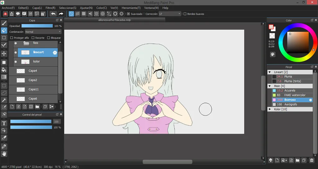

Now with the base colors applied I proceed to do the shadows. In this case I decided to use the technique of “cel shading” with a bit of gradients to add some interesting effects.
To make the shadows I follow a very similar method to the one of the colors but a little bit more complicated. I work in a new layer on top of the colors with the “clipping” option activated, this layer will function as a base to merge the shadow colors I’m going to apply (very similar to what I did with the color that I applied in different layers and at the end I merge the all). Now, for each color I want to apply shadows I make a new layer with the “clipping” and I paint the shadows. At the end I use the “merge down” step but in this case I have to unselect the “clipping” option from the layers over the base shadow layer so it allows me to actually merge them down (else the program won’t let me do it).
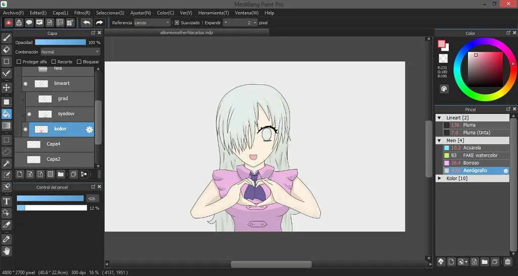

After the complication of the shadows I proceed to apply some gradients to some borders of the drawing, I do this in a layer on top of the shadows (always with the “clipping” option) and using the airbrush tool (which for me is the best tool to make gradients). In this case the base color and base shadow method is optional, sometimes I use it sometimes I don’t.


Now my favorite part
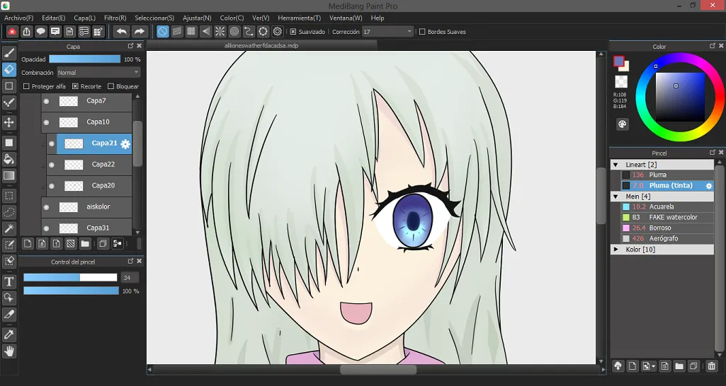
For the eyes I usually use 5 layers (not counting the base) which are: gradient, glow, pupil/figures, those white things that all the anime characters have, and effects. Sometimes I use a second layer of effects but that usually depends on the character.
To begin I apply the base color to the eyes, which is always a bright or “pastel” color, the rest of the layers will have the “clipping” option activated to not get out of the base area.
For the gradient layer with the airbrush tool I apply darker colors as I go up and at the end I apply the darkest color to the borders of the eye to create a “depth” effect, I also use the “blur” tool to mix the colors more smoothly in case I need to.
In the glow layer I apply the layer option “add” to make the colors brighter and I take the base color with the dropper tool. Then I make a semicircular shape under the place where the pupil would be. Generally I use the “hue” option (crtlu+ in medibang) and I play with the values for a while to apply a color that looks good.
The pupil layer is the easier, all you have to do is take the darker color of the eye, take it almost to a black color and do a long circle just in the middle. Generally I also draw some lines around the pupil and I use the “blur” tool on the tips.
My bad, the easiest layer is the one with the white circles, it just that, a pair of white circles.< br>
For the effect layer I only use the “multiply” layer option, take the darkest color and with the airbrush I darken the borders of the eye.
In this case I didn’t use the second effect layer but in the future I will show you how I use it.




And that was the process of creation for this drawing, I hope you liked it even though my artistic skills are very little developed. See ya.