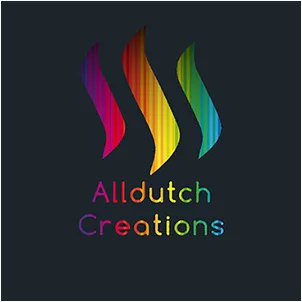
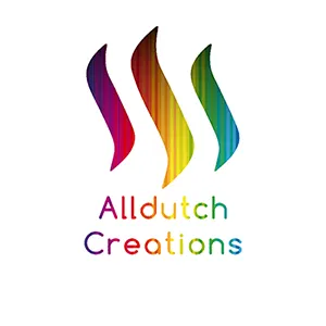
My Entry for The Alldutch Creations Logo and Divider Contest
When I read about the logo contest that was issued by @alldutchcreation I knew I had to give it a go. My brain went on with it straight away which was nice since I was getting bored on an empty train; noone to watch.
So yesterday, when it was too hot outside to actually enjoy the outdoors, I decided to play around with the ideas my brain produced on that train ride. The following is what I ended up with.
I created a logo, a complementary divider and a banner. All are designed with a transparant background, but I display them here with different background colours so you can see the effect in different background modes.
Logo


The rainbow colours I chose to fill the 'swushes' from the Steemit logo represent the versatility and colourfulness of the Dutch Creations community. The choice of font is a loose reference to the world famous Dutch design style "De Stijl" from the first quarter of the last century.
Dividers

divider in night toggle mode

divider in white background mode
Banners
I also created a few versions for a banner that could be used underneath posts, promoting Alldutch Creations or stimulating people to join.


The banners do have the background colours that are displayed.
I have tried to create a brand image that reflects both the platform Steemit, creativity, and the heritage of Dutch design. At the same time I made an effort to design a logo that doesn't steal an artwork's spotlight when displayed together in an image.
We are of course talking about the first stage here. Definite refinements will be made in a, hopefully, later stage.
I am anxious to find out what you think of my logo entry. Feel free to send me any feedback or constructive criticism. This is actually my first official logo design ever and I wouldn't mind some pinpointers
Thank you, @anouk.nox for turning a very boring train ride into a creative brainstorm session 😊
And, of course, the best of luck to all the other contestants!


